Exploring Restaurant Logo Ideas
So, you are in need of some inspiring restaurant logo ideas? Well, here I will try to help you find your way to the best restaurant logo.
When it comes to food and restaurant logos, everyone seem to have an idea of what they like. Therefore to craft a captivating restaurant logo can be a game-changer in the ever so competitive culinary landscape.
First of all, you need a visual representation of your restaurant. Showing the world what you do and what kind of food you cook. So, when it comes to putting your own restaurant logo ideas together, then its important to consider all sorts of different elements. For example, have an idea of diverse design concepts available to you. All the way from the refined elegance of minimalist approaches to the bold, eye-catching imagery.
It can also be hard to consider symbolism and typography but it must be done. Most of all you will need to think about which symbol represents you the best and which typography would suit your restaurant logo ideas.

When you start a restaurant you realize quickly that a good restaurant logo has the power to attract and fascinate customers. In fact, it sets the tone of the kind of dining experience that you would like people to have. Everything needs to feel positive from the moment people walk through the door until they pay the check.
To instantly have brand recognition is crucial and its not easy to achieve but if you put your restaurant logo ideas to the test you can succeed. I mean it is not rocket science after all. Thoughtful use of color, shape, and typographic elements can increase the ambiance, cuisine, and overall brand personality you desire.
The Importance Of A Logo Name
Now to the all important restaurant logo name! A restaurant’s logo and name are the first things customers notice. The name creates a lasting relationship between your restaurant and the customer.
Of course the name should be:
- Catchy
- Easy to remember
- Reflect the restaurant’s cuisine or theme.
Check out some of the top restaurant names 2024. Some of them will surprise you. One thing you need to consider with your restaurant logo ideas is that the name will play a role in marketing and advertising efforts. Ultimately, a restaurant’s logo and name are essential for its success and growth. But you know that, right ?
The Best Restaurant Logos of All Time
There are a few restaurant logos that stand out in my opinion. Some of them were just iconic straight from the start but others became famous with a lot of branding behind them. Of course, the best restaurant logos are iconic and very memorable. Like for example, from the golden arches of McDonald’s to the simple elegance of Starbucks. These logos have become synonymous with their respective eateries. Good and bad. Whether bold and striking or minimalist and refined, the most successful restaurant logos are instantly recognizable customers recognize them regardless of where they come from.
Here are 5 of the best restaurant logos of all times according to The Logo Company:
Olive Garden, Applebee’s, Chili’s, Outback Steakhouse, and Red Lobster.
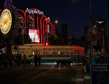
First example, the Applebee’s logo has evolved over the years, reflecting the brand’s growth and development. In fact, the original logo featured a simple apple icon, symbolizing the restaurant’s focus on fresh, quality ingredients. Then, as the chain expanded, the logo was updated to include the Applebee’s name. Which actually, created a more recognizable and cohesive brand identity.
Today, the Applebee’s logo continues to represent the company’s commitment to providing a welcoming dining experience for its customers. For Olive Graden, Chili’s, Outback Steakhouse and Red Lobster, the stories are very similar. They have all managed to stay true to their image but evolved over the years. To keep their brand story and identity intact but adding a modern touch to the name and logo.

Modern Restaurant Logo Design Ideas
Some of your restaurant logo ideas must include minimalistic and simple designs. More so, sleek lines, geometric shapes, and muted colors convey elegance. However, negative space creates visual interest. On the other hand, iconic symbols like cutlery or produce evoke cuisine. Also good to remember when you make draft is that you need your design to be versatile. A design that works in all logo dimensions.
Thoughtful typography enhances readability. Minimalist aesthetics exude sophistication. This case study for a food logo we did for a restaurant is good to read if you want to know how their restaurant logo ideas came to life.
8 things to think about with minimalistic and modern restaurant logo ideas
- Use simple geometric shapes
- Incorporate negative space
- Opt for a monochromatic palette
- Highlight the restaurant’s name
- Incorporate food-related icons
- Experiment with typography
- Ensure scalability
- Convey the restaurant’s vibe
Getting Creative
How do you get creative? Well, one idea is to immerse yourself in nature. Another idea is to explore new experiences. Perhaps to better find your inner child. Even, try to engage in mindful activities, surround yourself with art, and cultivate a growth mindset. Go to museums, visit a park etc.. Only you can stop your imagination flowing.
Understandably, your restaurant logo ideas need to include a certain balance. I think it’s extremely important to work with a professional logo company like The Logo Company. Come to us with your ideas and we can create the perfect restaurant logo for you. Taking away the hassle of thinking too much about what will look good.
Wrapping Up
Above all, investing time and effort into making a restaurant logo can pay dividends in the long run. Use your imagination and test your restaurant logo ideas on others so that you know you are on the right track.
Ultimately, you need to have a good idea of how you want it to look. Decide colors, symbols and theme. BUT most importantly, your food has to be excellent and your place needs to be clean and be as good as people expect.
For more inspiration on food logos check out The Logo Company’s portfolio.
