Returning Customer For An Updated Version of A Logo
I decided to write a case study for a food logo because everybody loves food, right? Most of us do remember the logo or the icon in the app when we order food. We also constantly return to the same food logo places if the quality of food is good don’t we? We have created many food logos over the years and this one particularly stands out in my mind. Last week we made study for a medical logo.
But, let me show you how but first some background information that the customer sent to us in his original food logo brief.
Food Logo Design Brief
Just the other day I got an email from the owner of Bloom Kitchen asking us to make edits to their original logo design. One that we also created for them. So the fist thing I did was to look at the original food logo brief for this case study. For more food and drinks logo ideas and creative inspirations for your brand.
Hello – you helped me create the attached logo way back when. I was hoping that you can help me revise it.
We will be opening a brick and mortar storefront and it should now read Bloom Kitchen & Co. Tag-line A Plant-Base Eater
Of course we could revise it. If you are an existing customer and you need to change simple things like names and colors, then we can do so for a cost of between $60-$80. This depends on how much you would like to change and how complex the design is.
The original food logo brief had the following information:
- Describe your company and what it does?
Quick casual and food truck industry. I developed a vegan food concept and do not know what to name it. I would need you creative help to determine name and logo.
Who Are Your Customers
My customers are private and other businesses who use my concept. We attract both male and female adults and teens. the millennial market and older more mature sophisticated crowds are more in tuned with better eating habits.
- Who are your competitors?
Other vegan only restaurants; veggie grill, organika, soulfoods, gooddot vegan eateries. I don’t see them as competition since 3 of the 4 are not in my state of CT. But they all do something similar to what i’d like to do. My concept is more a quick and casual service versus a full service restaurant.
- This logo is for?
A new business I am starting.
- Do you admire someone elses logo?
No
- The overall feel should be?
Contemporary
– Modern
– Casual
– Corporate
- Color Information .What colors would you like to use?
Your call Colors we should avoid? I’m open to your design
- Font Choice Font preferences?
Use anything but must be easy to read
- Creative strategy?
I look forward to seeing your creativeness.
- What applications do you have in mind for your logo?
Web Design
Initial Concepts In This Case Study For A Food Logo
Below you can find the original logo design concepts that we sent to the customer. I was particularly please with number 2 and 3 but taste is always subjective so I was excited to hear what the customer thoughts were.
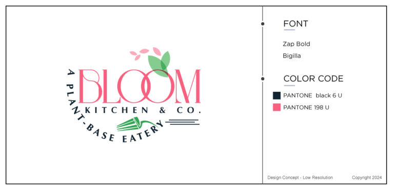
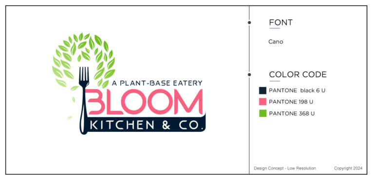
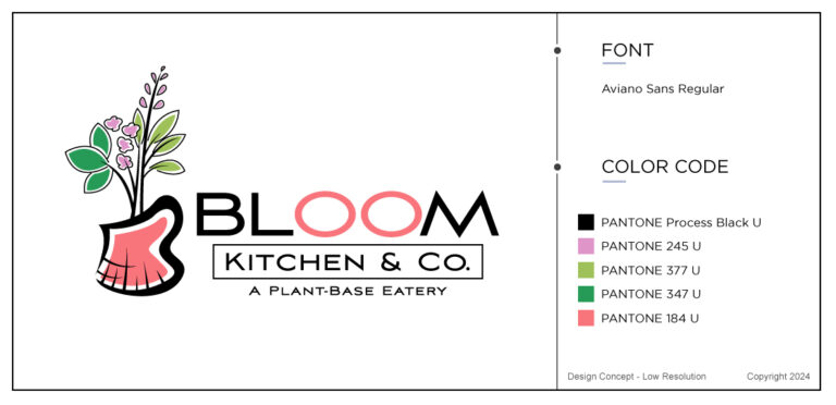
The feedback from the customer in this case study for a food logo came back positive.
Lets use Design Concepts Agnew
* make the word “PLANT-BASE” GREEN COLOR
* REDUCE THE SIZE OF THE STEM ON THE HERBS, JUST A LITTLE, THEY SEEM TO HIGH OUT OF THE CHEF HAT
Revision Round 1
This is the result of the first revisions instructions that were sent to us.
Revision Round 2
The feedback from the customer came back within 24hours. “Please make hat appear more like a “chef hat” I do not want folks to confuse it with a “flower vase”. Perhaps complete the black lines in the hat to make it more like a chef hat. Actually, no vase. please make it a chef hat. Keep the colors.
Revision Round 3 In This Food Logo Case Study
Below you can find the alternations that the designers made to the chef’s hat. No mo ore vase but the color was kept.
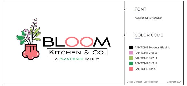
It did not take long until the customer came back and wanted the following revisions made in this case study for a food logo.
“I would like to see 2 versions of this design
.
Design Revisions Agnew2a
1. Color the whole hat
2. Color only from bottom up to line of hat.”
Revision Round 4
So, the designers got to work and created two food logo versions like the customer requested. This usually takes up to 2 working days as all our work is scheduled. There is not limit to how many revisions you can make as we want you to really come out with the logo that you like. Even love!
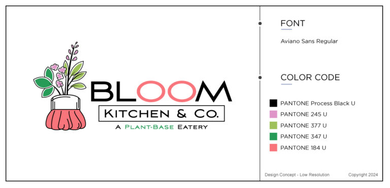
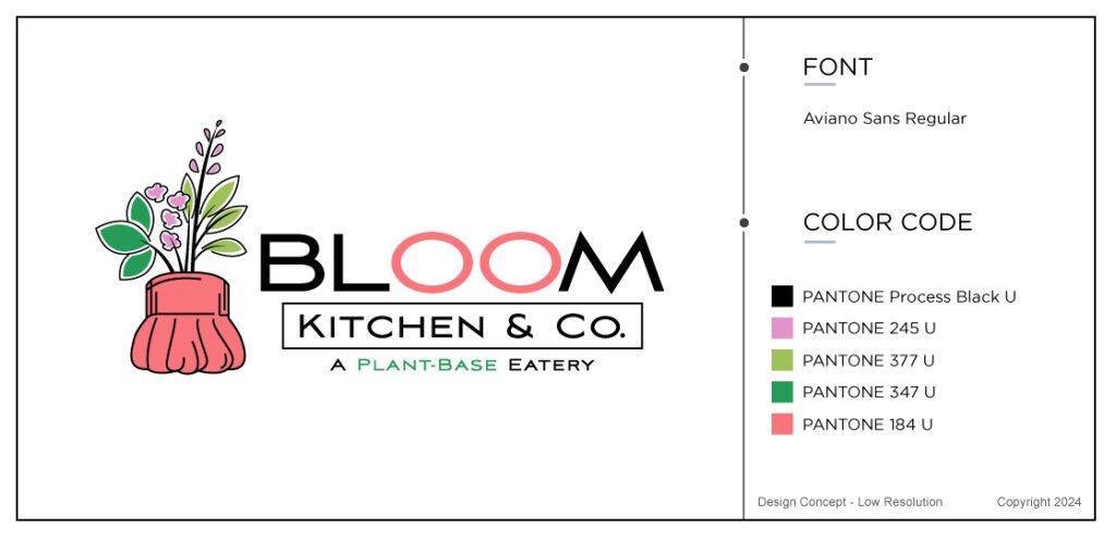
Now, the feedback was in and it had more revision requests for the second design.
“Design Revisions Agnew4b – color white portion of hat with chalk black (brush stroke of some sort)
Final Revision Request
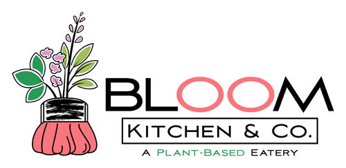
This his became the final revision for this beautiful food logo design for a plant base eatery. But hang on do you not say plant based eatery? catching sooner. “
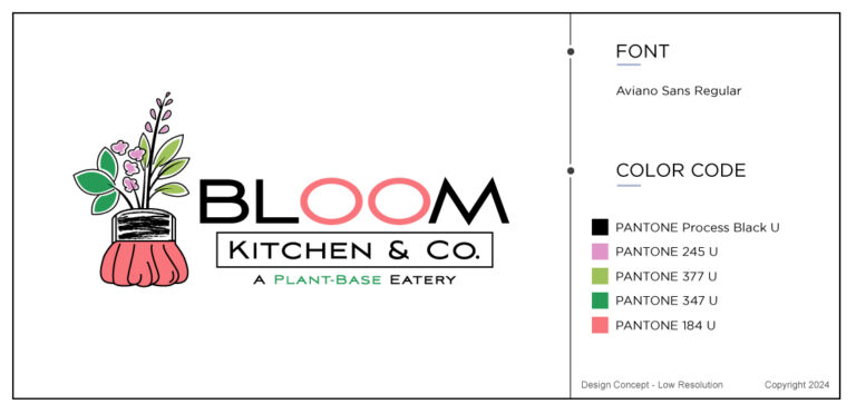
As soon as I thought that the customer came back to me and said:
“I just realized that there is a misspelling on “Plant-base” it should be “plant-based” with a d at the end. Can you please revise and resend the final files? I apologize for not
Of course we would change this free of any charge. She only just finished the design and we did not spot it either. Everybody was delighted with the finished food logo. I mean its absolutely gorgeous. Don’t you think?
Wrapping Up
Last few words to wrap up this case study for a food logo. Please read the annual state of the restaurant business 2024 to understand just how lucrative the restaurant business is. It was our pleasure to work with this customer and the new edited design looks fantastic in my opinion. We are excited for what the future holds and we keep on designing logos that people love. Take a look at The Logo Company’s portfolio for more inspirational food designs in the culinary department.
