Exploring the Best Team Logo Designs
How do you get the bets team logo design to make your players and supporters proud? It does take a bit of planning and thinking about but if you follow this guide you will have a better idea on how to unlock the best team logo for you. In this article we will explore the do’s and don’t in the art of designing the perfect logo.

Above all, team logos are more than just visual representations of a brand. They are the team, a powerful symbol that shows exactly what you are all about. From hockey, tennis, baseball to football, everybody needs a powerful iconic team logo design to win.
In this article, we dive into the fascinating world of the best team logo designs. Trying to uncover the stories, the design principles, and the impact they have on fans and the broader sports landscape.
So, whether it’s the bold and dynamic logos of professional teams or even the cherished emblems of loved college programs, each design holds a unique brand story that is devoted to its fanbase. Now, read on as we uncover the design elements, the creative processes, and the cultural significance that make these team logos truly exceptional.
A Comprehensive Guide: How to Design a Team Logo
These 8 steps below will help you in your planning of a new team logo and its will also make sure that you end up with a unique look that your team will love.
1. Understand Your Team’s Identity
First of all, define values and mission. Before you dive into creating a logo design idea it’s important to clearly understand what your team represents. Take a good hard think about your team’s core values, mission, and the image you want to project. Ask yourself, is your team dynamic and energetic? Perhaps you want to show a sense of strength and resilience? Knowing this will definitely help guide your design choices.
Example: For a corporate team focused on innovation, sleek and modern elements may work best, while a sports team might prefer a bold, aggressive look.
2. Choose the Right Symbols and Imagery
Now, lets talk about the all important iconography. More importantly, the right symbol or icon can really show the main focus of your team. Its well known that many sports teams use animals, weapons, or abstract symbols to convey strength or agility. However, corporate or community teams often use tools or abstract shapes that represent their goals or industry.
One thing to really consider when it comes to iconography and imagery is to make it personal. The importance of personal connection is crucial. Consider symbols with a personal connection to the team—something that reflects your team’s history, location, or shared experiences.
Let’s take one example, The Chicago Bulls. Here you can see that logo uses a fierce bull to represent power and strength. This is done to perfectly show the aggressive energy of the team.
3. Select a Strong Color Palette For Your Team Logo
Social media and everywhere you look is all about colors. The emotional impact of color is understandably one of the most important aspects of your team logo design. In fact, colors play a significant role in the perception of your logo. What you would like people to know about you. Almost like a personal diary. Read our infographic on color emotion guide as this will be extremely useful for you to pick the right colors for your team logo design. For instance, bold colors like red, black, and blue often signify strength, energy, and professionalism. However, softer colors like green, yellow, and orange can evoke creativity and collaboration.
Once you have decided on colors, do also make sure that you are consistent with them. Brand consistency is important as it makes sure that the colors you choose are the same with any existing team branding or affiliations.
One example that demonstrates this well is The Los Angeles Lakers. The team logo designs purple and gold convey royalty and success. One could say it creates a feeling of championship pride.

4. Pick the Right Typography For Your Team Logo Design
My favourite step is when you have to pick typography style. Remember that the font you choose should complement the personality of the team. I would recommend using Serif fonts to add tradition and authority. Or the sans-serif fonts to make your team logo feel more modern and approachable. For a sports team, bold, uppercase fonts are often favored to express dominance and power.
When it comes to trying to customize your fonts then consider custom typography or stylized lettering to make your logo unique. More so, the letterforms can be manipulated to add or integrate symbols or movement. Ultimately, this will add a certain feeling to the design.
One obvious example is The New York Yankees logo. The team logo uses intertwined custom typography that gives the team a timeless and iconic look.
5. Incorporate Team Logo Versatility and Scalability
Just like the title says do try to create a design that you can use on all sorts of marketing material in all sorts of logo dimensions. To have multiple uses for your team logo design is more important now than ever before. After all, your logo should look good in various formats. All the way from digital screens to printed jerseys.
Try to make your design simpler if you can as this will be better and cheaper for you in the long run. Ensure that the logo is simple enough to be recognizable from a distance or when scaled down to small sizes, without losing any of its qualities.
One example is that of the Nike Swoosh logo. A classic example of a simple yet powerful design that works across all sizes and mediums.
6. Use Negative Space Creatively
We all know that to use negative space can give your design that bit of extra. Therefore, if you can add depth and creativity in the shape of negative space then do it. Furthermore, negative space can be a clever tool for adding depth to your design. More so, it involves using the empty space around and within the logo to form hidden shapes or symbols, adding an extra layer of meaning.
I would use negative space in a team logo design to add more of a subtle message. This technique is especially effective for logos where subtle and sophistication are key.
For instance the FedEx logo famously incorporates an arrow in the negative space between the “E” and “X,” symbolizing speed and direction.
7. Iterate Your Team Logo Design and Gather Feedback
Try different designs out is another advice that I have. Create multiple drafts of your logo and experiment with different versions. Try changing color schemes, fonts, or layouts. Then, more importantly, compare them to see which version best represents your teams spirit.
The all important team input. Of course, gather feedback from your teammates to ensure the logo goes down well with everybody. Its important that you like it but equally important that your friends and team mates like your team logo design. After all, a successful logo should feel like it belongs to the entire team, not just the designer.
Don’t hesitate to refine your work. By using the feedback that you got, make the final adjustments and perfect the design.
Last example, the NFL team Washington Commanders rebranded their look based on feedback from engaged fan to create a logo that felt authentic to the team’s spirit and identity.
8. Test for Longevity
More importantly, a timeless design should last forever. A great logo should last for years without feeling outdated. Therefore, avoid overly trendy or edgy design elements that might lose appeal quickly. Try opting for a design that will remain relevant as your team evolves.
However, even if you want to remain timeless, it’s important to add a bit of room for a modern touch. Like for example occasional updates or modernizations to stay fresh.
The Adidas logo has managed just that. Cleverly succeeded in maintaining its core over the years while adapting to modern trends, all whilst not loosing its soul.
The Importance of a Good Team Logo Design
It’s very important to understand that a good team logo design is essential for building a strong team members and fan base. Not only does it visually represents the team’s values but also personality. Giving your supporters a valued place in the team. Furthermore sport logos help the team stand out in a competitive environment. By creating a powerful symbol, you can boost morale, and contribute to long-term success.
Inspiring Examples of Team Logo Designs
Here are three examples of lesser known but edgy team logo designs that offer unique inspiration.
1. London Spitfire (Overwatch League)
So why is this one edgy? Well, the London Spitfire logo is a sleek, minimalist design. A very cleverly designed logo, featuring a stylized World War II fighter plane inside a shield. Showing the city’s history while adding modern sports aesthetics. Color wise, the bold orange and blue color scheme stands out. However, the clean lines and dynamic shape adds energy and speed. Read more about the London Spitfire team and their success and origins of the logo.
2. Savannah Bananas (Baseball)
Second example, the Savannah Bananas. In fact a minor league baseball team thats has an eccentric, fun logo featuring an anthropomorphic banana swinging a bat. This team logo has a bold, cartoonish style with a playful theme. To further highlight the team’s lighthearted personality and commitment to entertainment. This is what really makes it a standout in the more traditional world of sports branding.
Tip! Don’t be afraid to add bit of humor and playfulness to give your team an identity that breaks conventions.
3. Dallas Fuel (Overwatch League)
Last example has to be the Dallas Fuel’s logo. A sharp and abstract flame in cool blue tones. The flame really adds energy and power to the design. Above all, this is a clean, minimalist design with contrasting colors. The warm colors associated with flames shows a bit of a modern touch to the design.
Tip! This logo proves that simple and abstract shapes combined with unconventional color choices can result in a modern look and feel.
These 3 examples highlight the power of creativity and that you can really step out of your comfort zone and add boldness and playfulness to your team logo designs. Pick your color wisely!
Examples From The Logo Company's Portfolio
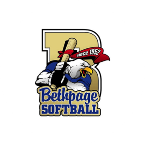
Over the years we have of course made some fantastic team logo designs ourself. Check out our sports logo portfolio. I’ve put 4 of our own creations on this page to illustrate just how perfect logos can be. The first example is Bethpage softball with a strong looking hawk holding a bat. The character logo is strong and the power of the bird can easily be seen.
The second example below is a totally different design with a golden owl for Dunbar athletics. The one thing they have in common is the power and strength that the tow different designs portrays. Different design but with the same winning feeling.

Things in Design To Avoid
You want to have the best sports logo ever and not the worst sports logo of all time. Therefore it is important to take a look at some team logo design that did not quite hit the mark of being good looking.
Wrapping Up
In this article we have given you 8 steps to create a good team logo design. In conclusion one can say that designing a team logo is both an art and a strategic process. First you need to understand your team’s story. Secondly, you need to select the right imagery, colors, and typography. Logo dimensions and that fact that you need to be able to re-size the design is going to be important to. Lastly, gather input from your team and refine your logo design concepts again and again A perfectly designed logo inspire pride among players and fans alike. Actually just like everything else you now need to sell yourself on the market and be a really good team. Growth is a team sport after all. Good luck !