First of all, when deciding on a look for your edgy logo, it is easy to fall in to the allure of a simple design with minimal color. However sleek they look when done correctly, I know there is a fine line between stylish and lifeless. More importantly, I believe the art of the perfect edgy logo design should not go under-appreciated. For instance, consumers are naturally drawn to bold colors and designs. In an oversaturated market, any marketer will tell you that brand recognition is everything. I’m telling you that the core of your brand recognition efforts is its logo, your edgy logo. Knowing this makes it easy to understand why an edgier look is a popular choice for businesses and organizations looking to make a bold statement. Above all, to try creating a memorable look that customers will be drawn to.
1. Use color to make your edgy logo even more unique

First of all, I know that colors play a crucial role in creating your edgy logo. For instance, bright and bold colors can often be used to grab attention and make a lasting impression. For example, if I use a bright neon color in a logo it can make the graphic stand out and be easily recognizable.
Furthermore, you see color selection is an integral part to designing a memorable logo, as colors subconsciously convey messages. You can read more about this in our blog post about the psychology of color. For the purposes of creating your edgy logo, however, choosing a bold color palette can convey a sense of fun and excitement.
I can show how this was done by us for Fun Party Rentals. They needed a fun memorable look. This exciting custom logo design from The Logo Company’s portfolio is great edgy logo inspiration. I think showing a perfect example of how a business can utilize color to create an eye-catching design that is aligned the business’ mission.
2. Cool fonts can form your amazing edgy logo

Even if bold colors arent your thing. I know some cool fonts that are great options to create interest while utilizing a more neutral color palette. More importantly, I see that edgy fonts often feature visually interesting shapes and designs that are unique to each logo.
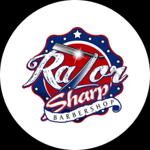
Let’s look at this for example. The Razor Sharp Barbershop that designed by us at The Logo Company. I believe that the font features creates a relevant play on the company name and purpose. More so by featuring a stylized razor in place of the ‘z’. As you see accompanying this focal point are three different fonts that all serve to add dimension and interest to this custom logo. I believe that you can make the same for your edgy logo. Understanding that despite of a neutral color palette this design stands out and draws your attention, which is exactly the goal of your edgy graphic.
3. Ensure your edgy design stands out with a unique shape

Furthermore, utilizing unique shapes is also a fantastic way to make your edgy logo more exciting. I understand that the benefit of a cool logo look is that it is distinct and set apart from competitors. Although loud colors and artistic fonts are not always appropriate for the corporate world. More importantly, shapes introduce a fun yet professional way, keeping the graphic from getting lost amongst the noise. My designers at The Logo Company design custom and unique 3D logos, including this corporate logo for Metro Steel. I know that designs like this are an excellent way to create visual interest while opting for a sleek, professional colorway and font.
In conclusion colors, fonts and shapes play a crucial role.
I believe it especially when creating your edgy logo design that will catch customers’ attention. Furthermore, knowing the use of bright and bold colors, unique fonts, and abstract shapes can make your brand stand out and be easily recognizable. However, it’s also important to remember that your cool logo should still be legible and easy to understand.
I have seen that a too clever logo that is too complex or abstract may be hard for people to remember or recognize. Remember that there is a fine line between edgy and unprofessional. My professional logo designers are eager to help you navigate it by creating a custom logo design with the perfect amount of edge!
