Tradesman Logo For Pipes Direct USA
A few months ago we got an exciting order that I really want to tell you about. Mainly because it’s a logo design for a tradesman in the USA that I like. Believe me, sometimes I do not have the same taste as our customers, not that is a problem but its real good when you have one customer you think made the right choices when creating their new handyman logo. So let’s start with the tradesman logo brief.
The Customer's Tradesman Logo Brief
First of all the customer Chris filled out a logo brief that we have on out website. In this brief he can put all the information and inspirations that he want us to have when we create his logo. In this case study for a tradesman logo, Chris gave us a few pointers to start the logo designers off in the right direction.
More so the customer described his company in the following way “E-Commerce Retailer of PVC pipe, Strut, Rigid, EMT and other items related to electrical, telecom and infrastructure”.
To the question who are your customers, he answered “General Contractors, Electrical Companies and General Public. Furthermore we needed to find out who he believed his biggest competitors are to which he said, “Electrical Distributors – Sonepar, Consolidated Electrical Distributors (CED), WESCO, REXEL”
Preferred Design Style
However, the preferred design style he was not sure of so that was left entirely up to us. The name, on the other hand had been set to PIPES DIRECT USA. A great name that is easy to remember. He would use this on their website ,social media, probably some clothing for example, hats and shirts.
The overall feel should be…
– Artsy
– Modern
– Corporate
Further more, the customer provided some information on what he liked and envisioned it to be. “I like the idea of the shape of a pipe being used possibly. Maybe an arrow of sorts for direct, maybe hidden.
Case Study Color And Font Information
Now we have come to the color information in this case study for a tradesman logo. More so importantly, he wanted 3 colors and I was immediately thinking of the patriotic blue, red and white of course. That would go so well on a USA pipes direct logo. No information was given on the kind of font that Chris preferred.
Initial Logo Design Concepts Made For A Tradesman Logo
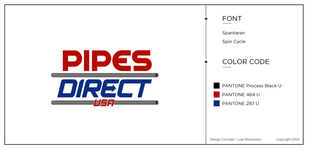
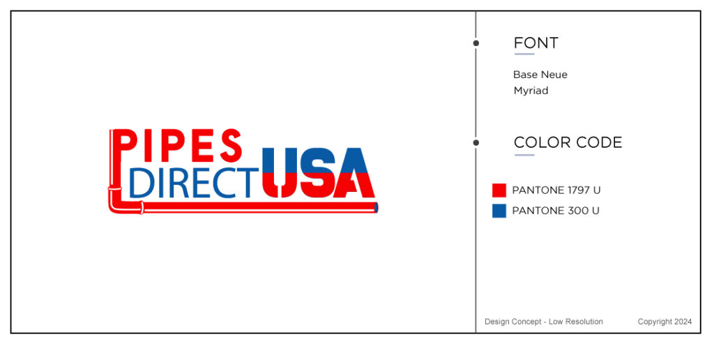
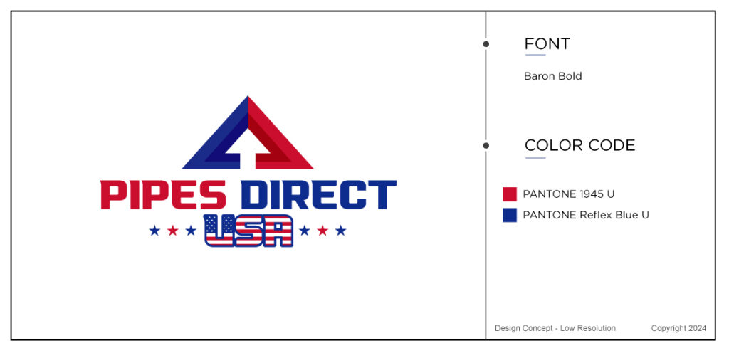
In this case study for a tradesman logo, the initial logo design concepts were ready within 3 working days. See some more logo design examples and get inspired by our portfolio in the section tradesman logos
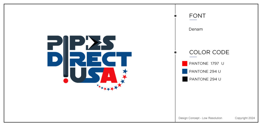
1. Logo Revision Feedback
So, now the feedback came back from the customer and it was mainly positive. He liked Grant, but wanted to increase the font size on Pipes and decrease font size on USA. Furthermore he wanted to add an arrow at the end of the pipe. The customer also sent us an image of a truck that he liked and asked if we could add the colors red, white and blue to it.
Below you can find what the designers came up with based on his feedback. Grant 2 is the first design with the truck and Grant 1 is the P that becomes the pipe.
Feedback Number 2 In The Case Study For A Tradesman Logo
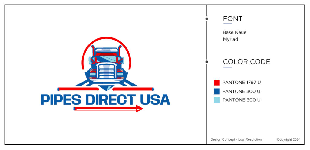
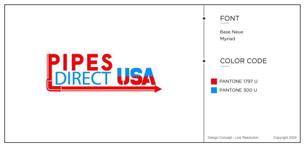
So, “Ok, I like the Grant 2. Let’s get rid of Grant 1. Not a fan of the “spear” on the bottom, it didn’t have the affect that I wanted, so let’s remove the tip. It will be cleaner that way. Other than that I think we are good to go”
This is good news as the customer is almost ready to finalize this handyman logo. I can clearly see why he preferred Grant 2 as the truck with the patriotic colors makes this ery balanced logo. One that is easy to remember.
Final Revision
Below you can find the final creation for Pipes Direct USA with the font and color code information also displayed on the right hand side. We can also provide you with a copyright certificate of your design if you need one. In this case this was not required.
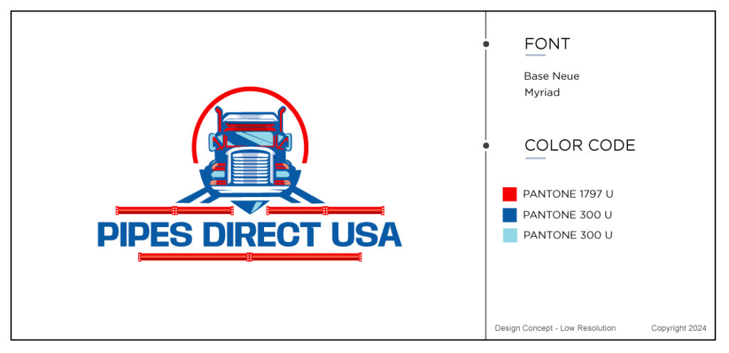
The customer was delighted with this last final touches of his new logo. His last and final comments were
“Looks great! SOLD”
Final Thoughts
This case study for a tradesman logo is coming to an end. Last week I told you all about a logo for a real estate client, in case you want more information on how a logo design is created by us at The Logo Company. Every day we have new customers asking us to create and envision their new logo design. Every market has big competition and the market for pipes direct and other electrical companies are no different. You really need to stand out with your trendy logo and I believe this one does.
Above all, this is another one of our happy customers and we love to make people happy by spreading a bit of TLC. If you want to check out some more why we have happy customers, find out what people say about us on Trustpilot or on Google. Check out the newest study for a medical logo.
