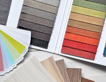
First of all, ask yourself the question, is color coherence really that important? In the sphere of design, the selection of colors and color coherence is of immense value. Of course, not just for aesthetic appeal but for conveyng emotions and creating atmospheres. One of the most harmonious and visually enticing approaches to color selection is the use of analogous color palettes. More so, this method, rooted deeply in color coherence theory, involves selecting hues that are near each other on the color wheel. Such palettes are known for producing a serene and comfortable feel. So, this is why they’re one of the most preferred choices for designers aiming for a cohesive look and feel in their projects.
What are Analogous Colors?
More importantly, analogous colors are three-color groups that are adjacent to each other on the 12-part color wheel. In short color grouping that have similarities. Typically, such a grouping includes one dominant color, which is usually a primary or secondary color. Furthermore, it is accompanied by two tertiary colors on either side of it on the wheel. For instance, you can have blue, blue-green, and green forming an analogous palette that’s both soothing on the nerves and easy on the eyes.
The key to mastering analogous color schemes lies in an in-depth understanding of the color wheel and the relationships between colors. Furthermore, this comprehension of color coherence empowers designers to come up with combinations that offer visual appeal and thematic consistency. After all, these are elements essential to brand personality, interior design, and fashion, among others.
Advantages of Analogous Color Palette Schemes
Check out these upsides of leveraging analogous colors:
Natural Harmony
Analogous colors occur together organically in the world around us. They evoke a sense of perfect harmony and balance. This natural alignment makes these palettes pleasing and restful to the eye, ideal for creating a laid-back ambience.
Cohesion and Unity
Picking colors close to each other on the color wheel guarantees a cohesive look that is less jarring than contrasting color schemes. This makes analogous colors a safe choice for creating a unified design that still offers variety and interest.
Flexibility
While offering coherence, analogous color schemes also provide flexibility. Designers can adjust the saturation and brightness of their selected colors to create the desired mood, from vibrant and energetic to soft and tranquil.
Challenges and Considerations For Harmonious Color Coherence
While analogous color schemes offer many benefits, they come with their own set of challenges. Since beauty is different for everyone, these color schemes, while they do add some contrast, might not be enough for everyone. Some designs may seem boring or too simple because of the limited range.
Therefore, to combat this, designers often incorporate even more varying shades, tints, and tones of the selected colors to add depth and interest further. Additionally, the use of a complementary color as an accent can introduce the needed contrast while maintaining the overall harmony of the design. A beautiful example would be the dynamic contrasts of vivid hummingbird artworks.
Another consideration is color dominance and balance. For example, selecting one color to dominate the palette, with the others serving as supporting hues, can create a clear focal point. For instance, it can also guide the viewer’s eye through the design. This approach helps in maintaining balance without overwhelming the viewer with too many competing elements.
Practical Applications For Analogous Palettes
Analogous color schemes are highly versatile and can be applied across various design disciplines, such as
Interior Design
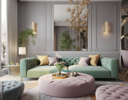
They create a serene and cohesive space, ideal for bedrooms and living areas where comfort and tranquility are paramount. In designing tailored living spaces analogous color palettes can also evoke harmony and cohesion in design. This allows focused productivity, enabling a seamless environment conducive to the modern, work-from-anywhere generation.

Branding and Marketing
Analogous colors can convey a brand’s personality in a subtle and unified way, creating visually appealing logos, packaging, and advertisements.
Website and App Design
These palettes can enhance user experience by creating a visually cohesive interface that is attractive and easy to navigate.
Tips for Working with Analogous Colors
Apply these strategies for optimal results when using analogous colors for your design projects:
- Choose Your Dominant Color Wisely – The dominant color will set the tone of your design, so choose one that aligns with your targeted mood and message.
- Incorporate Neutrals – Add black, white, or gray to provide contrast and breathing space for your colors to shine.
- Play with Saturation and Brightness – Adjust the saturation and brightness of your colors to add depth and complexity to your design.
- Use Textures and Pattern – Introduce different textures and patterns to cut up the monotony and add interest to your design.
- Test Your Palette – Always test your color palette and read this color emotion guide in the context of its intended application. This will help ensure that it conveys the right message and emotion.
Parting Thoughts
Color coherence and the art of analogous palettes is a testament to the power of color in design. By carefully selecting and implementing colors that sit near each other on the color wheel, designers can create works that are harmonious, emotionally resonant, and visually appealing. The beauty of analogous colors lies in their versatility and the inherent natural balance they bring to design. All these reasons make them an invaluable tool for any creative professional worth their salt.
So, whether you’re crafting a lifestyle brand, decorating an interior space, or developing a digital interface, embrace the subtleties and strengths of analogous color schemes. With thoughtful application and a sharp eye for balance and contrast, analogous colors can transform your designs, imbuing them with color coherence, depth, and beauty.
