The outdoorsy lifestyle is all about embracing simplicity, adventure, and nature. When it comes to branding for outdoor gear brands, it’s crucial to encapsulate these values. Your logo is the first thing people see when they come across your brand, so it should accurately reflect the essence of what your brand stands for.
In this guide, we will share tips and tricks on how to design the perfect outdoorsy logo for your brand:

Colors: A Crucial Part of Designing The Best Outdoor Logo
The colors you choose for your logo are an important aspect to consider. Different outdoor activities have different colors associated with them:
Camping Brands
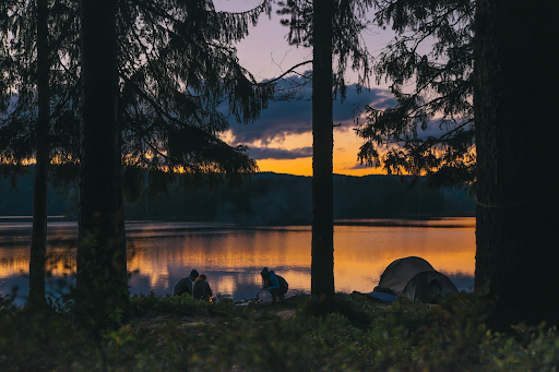
When designing a logo for an outdoorsy brand that specializes in camping gear, naturally occurring colors like greens and blues can communicate your brand’s orientation towards the outdoors. These colors represent the lush greenery and sparkling waters that are usually found in and around campgrounds, and they communicate a sense of tranquility and peace, which is what campers seek when venturing outdoors on their camping trips. As an avid camper myself, when I am shopping for camping gear, I am immediately drawn to colors that remind me of what I love about camping. Emulating nature and the feeling of calmness through the colors used in your logo will surely help to attract your target audience.
Hiking Logos
When it comes to hiking brands, greys, burnt oranges, and greens are the perfect choices. These colors represent the terrain of the trails, and they evoke a sense of adventure and excitement. If you are a local company that markets to adventurers in certain areas, utilizing the colors of that specific terrain is an excellent idea. For example, if you make boots specifically for Red Rocks in Utah, use those colors in your brand.
Outdoor Gear Brands Specializing in Water Sports
Bright colors are a popular choice for surfers and enthusiasts of many water sports. These colors reflect the thrill and excitement of crashing waves and rough rapids. Using neons will create the perfect outdoor adventure logo and emulate the brightness of the sun, which is a key element for people who enjoy water activities. Roxy, Catch Surf, and Sex Wax all utilize this strategy, which also makes their logo stand out when used as stickers on surfboards, which is a popular art form for surfers. This is particularly advantageous when captured in photos at competitions, as it is free advertising for the logo that catches the most attention.
Shapes: Show Which Kind of Outdoor Brand You Are
The shapes used in your logo are an excellent way to communicate the purpose of your company. Like colors, different outdoor activities have different shapes associated with them.
Shapes to Use in Camping and Hiking Logos
If your outdoorsy brand targets land activities, here are some shapes to consider:
Designs for Mountain Brands:
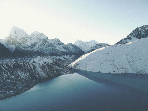
Utilize a shape somewhere on the scale between abstract triangles and elaborate mountainscapes. Use shapes that mimic the peaks and valleys of the mountains to draw the attention of potential mountain-loving customers. Patagonia, for example, is one of the most iconic mountain logos on the market. It is a profile of the Cerro Fitz Roy mountains, because that was the founder, Yvon Chouinard’s, favorite mountain. This falls on the elaborate end of the spectrum, where Dakine and Marmot’s logo designs are more abstract, featuring triangular shapes that loosely resemble mountain peaks.
Ideas for Forest Logos:
Trees are the obvious choice; however, deciding what kind of tree to use is essential. There are so many options, from sequoias to redwoods to Douglas-firs to Joshua trees. Make sure to research what kinds of trees are found where your target audience adventures. In contrast, incorporating outdoorsy icons like pinecones or forest critters might help you stand out from other outdoorsy brands. Arcteryx, and Osprey are brands that have chosen the latter, with Arc’teryx’s Archaeopteryx skeleton, which is the earliest known bird, and Osprey’s logo that is, appropriately, an Osprey with its wings spread.
Designing the Best Outdoorsy Logo for Your Water Gear Brand:
For water brands, it is a great idea to use shapes that mimic waves or tides to represent the ocean’s thrill and the rapids’ excitement. This could be a simple wavy line or a more intricate design featuring waves and water droplets. Flowing water is a symbol of adventure and excitement, and the best outdoorsy logos encapsulate these emotions. Rip Curl and O’Neill are some of the most famous surf brands, while Wavesport makes kayaks and Hala Gear makes paddleboards, and all are great examples of brands incorporating waves in to their logo designs.
Typography: The Flair Your Outdoor Logo Needs
In addition to colors and shapes, the typography you choose for your outdoorsy logo is an important aspect to consider. The typeface you choose should reflect the values and personality of your brand.
Fonts for Camping Brands:
For camping brands, sans serif fonts are a popular choice. They are simple, straightforward, and give off a clean and modern vibe, which is perfect for the minimalist and peaceful atmosphere of camping.
Hiking Logos Need Adventurous Designs:
For hiking brands, bold and adventurous typefaces are a must-have. These fonts reflect the excitement and thrill of the outdoors, and they evoke a sense of boldness and confidence.
Outdoor Water Sports Brands:
For water sports brands, handwritten or script-style fonts are a great choice. These fonts are playful and adventurous, just like the thrill of the waves and rapids. They also evoke a sense of freedom and creativity, which is perfect for the free-spirited personalities of surfers and water enthusiasts.

In conclusion, designing the perfect outdoorsy logo is all about capturing the essence of what your brand stands for. Get nature logo ideas from outdoors. Choose colors, shapes, and typography that accurately reflect the values and personalities of your target audience and the activities they enjoy. Whether it’s camping, hiking, or water sports, the key to success is to keep it simple, stylish, and memorable. See money making ideas for outdoor entrepreneur if you need inspiration what can make money. With these tips, you are sure to create the perfect outdoorsy logo for your brand!
