Ever hear of the smokies logo trend ? Well, surprisingly, the Smokies logo trend is quickly becoming one of the most talked things in logo design for 2025. The images usually consists of soft curves, organic lines, and almost smoky fluidity. Actually, this trend shows the movement toward more human, real branding. Above all, businesses are moving away from sharp, geometric perfection and instead taking on designs that feel natural, approachable, and alive.
Why the Smokies Logo Trend Matters in Branding
We all know that every logo tells a story. One can say that the way that story is designed shifts with the times and the values people care about.Right now, consumers are needing the real stuff and warmth in a digital world that often feels sterile. The Smokies logo trend answers that need with gradients, wavy lines, and flowing textures that mimic the softness of nature.
The Smokies logo trend moves away from cold precision, leaning instead into shapes that feel like smoke in the air. Or like a mist on a hillside with ink blending into water. The effect is gentle and human, inviting a sense of flow and calmness. This 2017 study found that participants consistently preferred curved shapes compared to sharp-edged ones, suggesting a deep-rooted human preference for soft, flowing visuals, exactly what Smokies logos offer.
The Organic Appeal of Smokies Logos
In short, what makes this trend so appealing is its organic quality. More and more companies are realizing that not everything needs to be perfect to feel professional. Slight imperfections, natural curves, and soft transitions actually make a design feel more relatable.
For example, when compared to bold minimalism or retro-inspired trends, Smokies logos stand out by offering balance. They can look modern but never feel cold. They feel creative but not chaotic. This is why they are especially popular with wellness companies, lifestyle brands, and sustainable businesses . All industries where the emotional connection is just as important as the product itself. In fact, circular (curved) logos are associated with softness and comfort, whereas angular shapes convey strength and durability. It underscores how shape alone can signal emotion before any messaging even arrives
Industries Embracing the Smokies Logo Trend
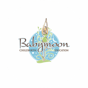
The Smokies logo trend is not limited to one niche. This is due mainly to its versatility. For instance, wellness logos and yoga studios benefit from the flowing, meditative quality of smoky lines. This reinforces the idea of breath and movement. Lets take, artisan food and beverage brands. These companies use the trend to signal craftsmanship and a handmade touch. Eco-friendly businesses adopt Smokies logos because the organic shapes feel aligned with nature.
However, it does not stop there as even personal lifestyle brands and creative entrepreneurs are drawn to the trend. Above all, it allows them to stand out with a logo that feels soft and human rather than corporate and distant. This is branding that feels like a conversation instead of a sales pitch.
Design Elements That Define Smokies Logos
The Smokies logo trend isn’t about strict rules, but it does have some recognisable features. For instance, rounded letterforms, curves that flow into one another, and textures that give the impression of haze or movement. Furthermore, gentle gradients often make this look stronger, adding a sense of dept without being too much.
To know about color emotion guide is going to be important. Most companies will use soft pastels, earthy neutrals, and muted tones. However, some brands opt for monochrome to keep the design understated. Actually, the key is to avoid harsh contrasts and instead perhaps lean into palettes that feel natural.
How to Use the Smokies Logo Trend Without Losing Clarity
Understandably, one big challenge with flowing, smoky designs is making sure the logo remains readable and functional. A brand identity need to be flexible across all the channels that you might want to use. For this reason, designers adopting the Smokies trend must carefully balance creativity with clarity.
We believe that a good approach is to apply the smoky, organic effect in moderation. For instance, a wordmark might keep its letterforms clean but add soft curves to certain strokes. Some designers might use flowing lines, but with enough negative space to keep it legible at smaller sizes. The magic of the trend lies in suggestion, not in overwhelming detail.
Why Consumers Connect With Soft, Flowing Logos
The success of the Smokies logo trend also comes down to psychology. Humans are naturally drawn to organic forms. Soft, curving lines are associated with friendliness and openness. However, harsh, angular shapes can feel aggressive or impersonal.
One can say that the best part of this trend is its flexibility. No two Smokies logos need to look the same. Thats the really good part. A wellness studio might use wavy typography to reflect movement and perhaps a café might incorporate a steam-like swirl into its wordmark. Some businesses in sustainable fashion could choose an icon with natural, smoke inspired curves. Its all up to you.
More importantly, because the trend is more about mood than strict structure, it gives designers the freedom to experiment. Logo designers can then create an image in a way that feels true to their personality, without simply copying others.
The Future of the Smokies Logo Trend
While trends come and go, the Smokies logo trend feels more like a reflection of cultural values than a passing style. As long as customers continue to look for real life organic design elements will remain relevant.
Looking forward, this style could evolve with bolder gradients, experimental typography, or even some animation that makes the smoky quality come alive. You see the potential for the smokies logo trend is endless. At the heart of the trend, its softness and humanity, is likely to stay.
Should Your Brand Try the Smokies Logo Trend?
If your company and customers values calmness, creativity, or sustainability, then the Smokies logo trend could be a perfect fit. However, it’s not for everyone. Tech companies don’t like them. This is because the that want to emphasize precision and innovation. Another non goer are bold retail brands that’s might prefer strong, flat colors. The key is to match your logo style to your dreams and expectations.
Still, for many businesses in 2025, Smokies logos offer a refreshing alternative to overly crisp, digital-looking designs. They tell a story of balance, modern and natural, creative and clear, soft and strong. What are you waiting for?
Conclusion: A Softer Way Forward in Logo Design
In conclusion, the Smokies logo trend shows us how design continues to evolve with culture. In 2025, it reflects the growing desire for life as it is. A sense of calmness, and a human-centered touch in branding. Smokies logos remind us that not everything has to be perfect to be powerful. We are not perfect after all.
In a world of sharp edges and digital overload, a little smoke might be exactly what your brand needs.