In the world of branding and design, creating a logo that resonates with audiences and stands the test of time is a great challenge. While numerous design principles and philosophies exist. One timeless concept that continues to inspire logo designers and businesses alike is the yin and yang symbol.
Most of all, this is rooted in ancient Chinese philosophy and represents the interplay of opposites and the harmony found in balance. In this blog post, we delve into the fascinating world of yin and yang logo design. After all, to explore how this concept can support you in creating your balanced brand.

Understanding the yin and yang philosophy
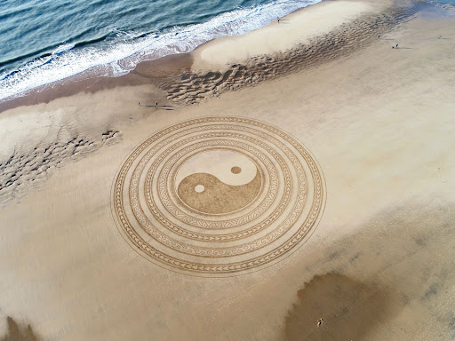
Above all, Yin and yang are often described as dualistic forces. For instance, they represent the dynamic interplay between opposing yet interconnected elements. More so, the concept is symbolized by a circular symbol divided into two halves by a curved line. One half being black (yin) and the other white (yang). Inside each section, there is a small circle of the opposite color. Showing the inherent interconnection of these forces.
Most of us know, the yin energy is associated with qualities like darkness, introspection, receptivity, and femininity. However, the yang energy embodies light, expansion, activity, and masculinity. However, these two forces are not in conflict with each other. Above all, a complement to each other.
Foremost, they are forming a harmonious unit that gives rise to the world’s diverse and intricate phenomena. Understandably, the philosophy of yin and yang is based on the understanding that these forces are in constant change and transformation. They are never in a state of absolute stagnation but instead flow and evolve. Much like the changing seasons for example.
Most importantly, one of the key teachings of yin and yang is the principle of balance and harmony. For example, it emphasizes that neither of these forces is superior to the other. Furthermore, the yin and yang philosophy shows that life is like a delicate dance of opposites. Finding a good balance between them is essential for our overall well-being. So, if you are interested in finding out more about the yin and yang philosophy check out this article!

Source image
Symbolism of a yin and yang logo
Most designers can skillfully weave the symbolism of yin and yang into various logo elements. Striking a perfect balance between subtlety and visual impact. After all, you can use several yin and yang-inspired elements to evoke that sense of balance for your brand. But also the choice of color might impact the perception of your logo design and assist you in conveying your message.
The Circular Shape
Obviously, the circular shape is a fundamental aspect of the yin and yang symbol. Therefore, you can incorporate it into your logo’s overall design to evoke a sense of unity and harmony. In addition you can also integrate elements that directly symbolize the yin and yang concept. For instance, water and fire are classic representations of yin and yang, with water embodying yin’s fluidity and fire embodying yang’s intensity. Integrating these elements into your logo can convey the brand’s balanced approach to its offerings and how it seamlessly adapts to different situations.
Colors of for your balanced logo
Let’s mention complementary colors, that also play a crucial role in yin and yang-inspired logos. Traditionally, the contrast between black (yin) and white (yang) is used to represent the duality of forces. However, designers have the freedom to explore a broader spectrum of colors to reflect the brand’s identity and core values. For instance, pairing warm and cool colors or bold and soft hues can evoke the yin and yang concept. While infusing the logo with a unique personality. These apparent opposites can depict this very philosophy and help you transfer your message.
Example for a yin and yang logo
Let’s take a look at the logo design of “Sacred Spirit,” a company operating in the wellness and spiritual industry. Just to illustrate the concept of yin and yang in logo creation. Here, similar to the classic yin and yang logo design, the company embraces a circular emblem as its foundation.
Creatively playing with two harmonious colors: a serene green and a mystical purple. However, what sets this logo apart is the addition of a captivating spiral that elegantly connects the separate areas.
Remember, the use of green and purple in the logo speaks volumes about the brand’s holistic approach to well-being. After all green, often associated with nature, growth, and healing, embodies the essence of yin. Representing the nurturing aspects that “Sacred Spirit” seeks to offer its clientele. On the other hand, the regal purple, signifying spirituality, intuition, and creativity, exudes the vibrant yang energy. Symbolizing the brand’s dynamic and transformative practices.
The logo’s composition is a striking visual representation of the interconnectedness and complementarity of contrasting elements. Just like the intricate dance of life’s opposites. This example also shows that especially brands operating in this industry can benefit from the yin and yang concept.

Wrapping it up: Striking the balance of your yin and yang logo
Now that we looked into the philosophy of a yin and yang logo we learned that several factors play a crucial role when designing a balanced logo. Keep in mind the symbols for a yin and yang-inspired logo design that can help you in transfering your brand message. Also you should consider the interplay of the colors you choose to depict the required balance. But you don’t necessarily need to incorporate specific elements to have a yin and yang logo.
The essence of a yin and yang logo lies not only in the specific symbols used but also in embodying the underlying philosophy throughout the design process. Embracing the concept of yin and yang as a guiding principle can lead to a logo that subtly communicates balance and harmony, even without overt symbolism.
