The Power of Color - A journey through feelings, emotions and associations
The power of color. I know it sounds pretty easy, right?. Those of you that have had a logo designed with us will know that one of the questions we ask on the order form is what colors you have in mind for your design.
But just why is color so important?. This article is the introduction to a series that will explore the power of color and the importance of color in branding and advertising. Here I will briefly discuss the physical and psychological effects of color on consumers, while in subsequent articles I shall be taking you on a journey through the rainbow, exploring the meanings and associations behind a number of commonly used colors.

So, the first way that the power of color works on us is purely physical. Determined by the way the human eye and brain process light. Namely, how visible a particular color makes something appear. Furthermore, every woman knows that a black dress will make her look smaller than a white one. I know that to be true. Also, a light colored text on a dark background has been found to be easier to read than a dark colored text on a light background.
![]()
![]()
Some combinations has the power to make you wince
As you can see, some colors work well together. I believe that while other combinations can make you wince, the power of color is also that colors can match tonally, or be complementary.
![]()
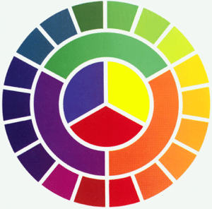
I understand that complementary colors are those opposite one another on the color wheel. For instance, purple and yellow, blue and orange, green and red etc. Furthermore, using complementary colors will typically give you a more striking design than tonal colors. Understandably, all of these are important points to consider when choosing the colors for your logo.

However, I believe that equally important is the psychological effect color has on us. Stimulating the nervous system and causing the release of various hormones. Some of these responses have been discovered to be hard-wired in the human brain. I believe that is the real power of color. Furthermore, a study by the University of British Columbia showed that red light can increase an individual’s attention to detail. See how many red logo design we have in our portfolio to understand just how popular red is. However blue light can increase their creativity.
More importantly, using fictional adverts and packaging the study also found that red packaging was more successful. Especially when it was giving specific product details. However, blue packaging worked better with evocative, creative messaging. All of these responses were entirely subconscious and I think this should be taken into account in the science of logo design.
Age, sex and cultural background affects the science of logo design.
Other psychological responses stem from learned behaviour and may depend on an individual’s age, sex or cultural background. In many cultures mourning is associated with black, for Hindus. However in China, it is associated with white, in Nigeria red, in Mexico and Ethiopia yellow.
Ultimately then, choosing the colors for your logo should be about more than aesthetics. You also need to take into account the science of logo design that is to say. The message you are trying to get across with your logo, and who your customers are. Keeping all these things in mind during the logo design process will help you to end up with a much more successful final product. Check out the color of the year!. Gorgeous Pantone of the year 2023
