I have been wanting to write an article about the nicest feminine logos for a long time now as we have developed so many over the years. Feminine logos often incorporate design elements and characteristics that evoke qualities traditionally associated with femininity. While these characteristics can vary depending on cultural and societal contexts, here are some common features that define feminine logos
In this article we will answer the following questions:
- What makes these logos particularly feminine?
- Do feminine logo design have similarities when it comes to colors, shapes and fonts?
- Are feminine logos usually character logos or caricatures?
What makes these logos particularly feminine?
Well, soft shapes, flowers and subtle symbols are some of the things that we associate with feminine logos but arguably its so much more than that. There are of course many similarities in fonts, colors and shapes that we will look at but also many differences. Over the years, feminine and masculine logos are not as distinct as they used to I believe. Furthermore, character logos or caricatures are often used to portray the feminine or the masculine.
Take a look at this list over what most people associate with femininity and feminine logo design.
Soft Shapes and Curves: First of all, feminine logos often utilize rounded shapes, curves, and flowing lines. Mostly to convey a sense of warmth, gentleness, and approachability. These shapes can be found in typography, symbols, and overall logo composition. One interesting article about logo shapes and why they matter.
Floral and Nature Elements: Of course, floral motifs, botanical illustrations, and nature-inspired elements are frequently used in feminine logos. For example, flowers, leaves, vines, and other natural elements can symbolize growth, beauty, and femininity.
Script Fonts:Another thing that you might have noticed is, script or handwritten fonts are commonly used to convey a sense of elegance, sophistication, and femininity. Most of these fonts often feature graceful, flowing lines and decorative flourishes.
Subtle Symbols of Femininity: Fourth fact is that some feminine logos incorporate subtle symbols or icons associated with femininity, such as hearts, butterflies, stars, crowns. Just to better stylized representations of women or feminine figures.
Emotional Appeal: More often aimed to evoke emotional connections with the audience by tapping into feelings of comfort, color coherence, nurturing, empathy, and beauty. These logos may use imagery and design elements that resonate with these emotions.
Whimsical and Playful Elements: For instance, some feminine logos incorporate whimsical or playful elements to convey a sense of creativity, fun, and lightheartedness. As well as adding charm these elements can also add personality to the design.
Do Feminine Logos Have Similarities In Colors, Shapes and Fonts
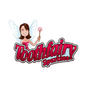
Yes, there are as you can see many similarities.Colors are usually bright and pink. Let’s look at this little cute character logo in the shape of a very pretty Tooth fairy. She has a lovely smile, looks charming and kind and she has sparks in the shape of little stars. All this ties in very well with femininity and love. The font is decorative and the shapes are soft. A lot of playfulness and emotional appeal to other mothers.
Lucy's Brother
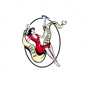
My second feminine logo design is Lucy’s Brother. Another logo with similar element to the Tooth Fairy design. Lucy is beautiful, charming and oozes femininity. Her red bright dress adds to the charms. Again, we see soft shapes, with a character logo that is warm and nurturing. However the font is not as decorative and easier to read. This design is more appealing for the masculine market.
The Feminine Logo For Zen Creatures
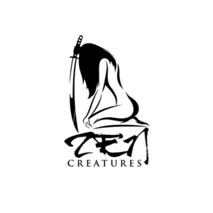
My favourite logo is not so similar to the other examples. But Zen creatures is in the shape if a slim powerful woman, all in black, holding a sword in her right hand. The shape is soft and girly, like the other designs and the font is a script font and decorative. The design is however, not whimsical nor playful but dark and serious. In my opinion, a curious character logo, with a fantastic powerful feeling.
Dirty Girl Bath & Body Feminine Logo Design
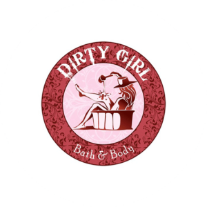
Now, we come back to the more feminine logo design that we are used to seeing. The brand name of this logo is Dirty Girl Bath and Body. First of all, the design plays with the name and the use if the product. The dirty girls can use this bath and body soap. All pink and soft with a script font again. The woman is happily sitting in her bathtub pouring bathwater on herself to get clean. The product is aimed at women and I cannot see any man buying this for himself at least. A study found that round shapes in a logo can evoke feeling s of happiness.
Precious Winks
My fifth example of feminine logos is this gorgeous black silhouette int he shape of a woman for a company called Precious Winks. A lot of similarities with the other example, most of all its a pink and black design. The character logo has starts and sparkles and again, the font is hand-written and decorative. The high heels gives a very girly impression along with the visible big jewlry and handbag.
The Feminine Body Beauty Rose

Slightly different logo as it is has not got a character. The floral symbol of the pink rose makes it a feminine logo. Again, a hand-written script that is soft and curved. The company seems beauty products and the customer are women. The branding possibilities are endless with such a perfect looking rose.
Lasting Looks By Lisa
This example, is feminine but also masculine I think. The tattoo artist is called Lisa and she creates lasting looks. The skull is pink and the design is two colored pink and black with star symbols. The symbols, stars, and big flowers is typical as well but there is a little hint of masculinity because of the use of a skull. One difference is the font which is fat, easy to read one.
Belle Mode Intimates
Now we have come to my last example. Belle Mode Intimates is a typical pink and black logo with a hand-written font. The company seems underwear and bras so all their customers are women. The character of the logo is in the shape of a woman holding a flower in her hand. Adding a very feminine touch to the whole feeling of the logo.
Are Feminine Logos Usually Character Logos And Caricatures
Throughout the years, there has been an abundance of studies and extensive research focused solely on logo design. Above all, it’s quite intriguing to observe that if the target audience is primarily composed of females, the employment of character logos and caricatures tend to have a more prominent and integral part in the complete design procedure.
Of course, this is not true for all companies as we have seen one example of here. There are plenty of others. Additionally, gender stereotypes are evolving, and contemporary feminine logos may challenge traditional notions of femininity by embracing diversity, inclusivity, and empowerment. Feminine logos encompass a broad spectrum of design styles and elements, and while some may incorporate characters or caricatures, they are not inherently characterized by these features.
Character logos and caricatures can indeed be found in feminine branding, especially in industries like fashion, beauty, and children’s products, where adding a human touch or conveying a specific personality is desired.
Wrapping Up
In conclusion, feminine logos encompass a diverse range of design elements and characteristics that evoke qualities traditionally associated with femininity. From soft shapes and pastel colors to floral motifs and elegant typography, these logos convey warmth, sophistication, and emotional appeal.
While some designs may incorporate characters or caricatures, many others rely on wordmarks, symbols, or abstract designs to create a unique visual identity. Whether it’s for fashion brands, beauty products, or lifestyle blogs, the key to crafting an effective feminine logo lies in understanding the brand’s identity, target audience, and objectives.
By embracing diversity, creativity, and inclusivity, feminine logos continue to evolve and challenge traditional gender stereotypes, empowering brands to connect with audiences in meaningful and authentic ways.
