Are you starting a barbecue business and looking to create a striking logo that captures the essence of your smoky, mouthwatering cuisine? At The Logo Company, we understand howchallenging it can seem to design and bring to life a logo. At least one that is memorable, aesthetically striking, and functional at the same time. Fortunately, with the right tips, ideas, and examples, you can implement a custom logo with the confidence that you’ve made the right choice.
In this guide, we’ll explore some fantastic tips and ideas for a BBQ logo. Most of all that will set your brand apart from the competition. Don’t forget: a well-designed logo has the power to captivate customers. Evoke emotions, and establish a strong visual identity for your food and drink business. So, get ready to savor some delicious logo inspiration!
The Must-Haves: Choosing the Right Elements for Your BBQ Business Logo
When creating a logo for your BBQ business, there are some must-have elements that you’ll need to implement. These elements will not only make your logo visually appealing but also help convey the essence of your brand.
Some of these components include:
● Colors and tones
● Your brand name or tagline
● Images and visual elements
● A structured composition
Additionally, when following official guidelines, you should make sure that your logo is simple, relevant, timeless, high-quality, memorable, easy to use for different media forms,
From colors and fonts to iconic images and taglines, choosing the right elements is crucial for capturing the attention of your target audience and making a memorable impression. So, let’s dive into the must-haves when it comes to designing an effective BBQ business logo.
Reflecting the Essence of BBQ in Your Logo Design
When designing a logo for your BBQ business, it is important to reflect the essence of the BBQ dining experience and convey your brand values. Consider incorporating elements that symbolize hospitality, such as a warm color palette or an inviting graphic of a cozy outdoor gathering.
To capture the conviviality and love for good food your company holds as key values, you could incorporate images related to grilling or mouthwatering barbecue dishes, like juicy ribs or smoky sausages.
● Top tip: You may also feature elements that tell more about your business’s mission. For example, if you specialize in vegan or plant-based meat alternatives, or you only use grass-fed animal products, you can use visual elements that highlight these features.
Incorporating Meaningful Icons
When it comes to designing a logo for your BBQ business, incorporating meaningful icons can add depth and personality to your brand. For example, including a smoker or grill in your logo instantly conveys the essence of BBQ cooking and highlights what sets your business apart. A well-designed icon can become synonymous with your brand, making it instantly recognizable and memorable to customers.
Using Visual Elements (i.e.: Fire and Smoke)
When it comes to designing a logo for your BBQ business, incorporating visual elements related to fire and smoke is always an effective strategy to help potential users make up their first impression.
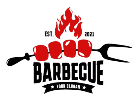
For example, you can feature flames or smoky swirls in your logo design to immediately convey the essence of BBQ and evoke a sense of deliciousness and sizzle. These visual elements not only make your logo visually appealing but also create a strong association with the smoky flavors and enticing aromas that make BBQ so tantalizing.

Integrating Your Brand Name and Tagline With Your BBQ Logo
When it comes to creating a memorable and effective BBQ logo, integrating your brand name and tagline is crucial. These are vocal elements that help you create your brand voice. Conveying more of your business’s mission, values, and personality. What’s more, by seamlessly incorporating your brand name and tagline into your logo. Not not only do you strengthen brand recognition but also communicate a clear message to your audience. But how can you effectively incorporate a name or tagline in your BBQ logo? Fortunately, there are several strategies you can leverage.
These include:
● Typography:
One way to integrate your brand name and tagline with your BBQ logo is by using typography. Choose fonts that reflect the personality of your brand. Align with the overall vibe of BBQ culture. For example, if you have a playful and casual BBQ joint, opt for bold and fun fonts. If you have a more upscale and sophisticated BBQ establishment, choose elegant and refined fonts.
● Symbolic representations:
Another approach is to visually incorporate elements from your tagline into the design of your logo. This can be done through creative illustrations or symbolic representations. For example, if your tagline highlights “smokin’ flavors,” you could incorporate smoke patterns. Perhaps a smoking grill into your logo design. This not only reinforces the message but also adds visual interest to the overall look of the logo.
● Composition of the logo your bbq logo.
Lastly, consider the placement and balance of your brand name and tagline within the logo layout. Experiment with different arrangements to find the most harmonious configuration. Keep in mind that clarity and legibility should always take precedence. Also ensure that both elements are easily readable. Even at different sizes or when applied in various marketing materials. You may also choose to only add your brand’s initials or part of the name. By integrating your brand name and tagline with your BBQ logo thoughtfully and cohesively, you create a powerful visual identity for your business. Above all that resonates with customers while effectively conveying what makes your BBQ experience unique.
● Top tip: Still wondering what is a good BBQ name? The Logo Company can offer you valuable insights into art and science of name and tagline creation.
The Visual Identity: What Colors Say About Your BBQ Brand
When it comes to creating a visual identity for your BBQ brand, the colors you choose are potentially the most impactful element. The colors used in your logo should align with the essence of your brand. Evoking the right emotions in your target audience. Below, we’ll look at how to use colors to maximize your impact in the eyes of the user.
Red, Brown, and Orange for an Authentic BBQ Feel
When it comes to creating a logo for your food business, the choice of colors plays a significant role in establishing an authentic and inviting atmosphere. Here’s how red, brown, and orange can contribute to that BBQ feel:
● Red: Symbolizing passion, energy, and excitement, red evokes a sense of intensity that aligns well with the bold flavors of BBQ. It’s also known to stimulate appetite,
making it an excellent choice for businesses focused on food.
● Brown: Representing earthiness and warmth, brown creates an authentic and rustic vibe that is often associated with traditional barbecue dining experiences. Although brown isn’t for everyone, this color can evoke feelings of comfort and nostalgia, two key elements that customers seek when indulging in classic BBQ meals.
● Orange: A warm and vibrant color, orange complements the smoky and dark tones of your logo. While adding a touch of playfulness. It signifies enthusiasm and creativity. Making it ideal for businesses that want to highlight their unique approach or menu offerings.
Although these colors are considered essentials for most BBQ business logos, don’t forget to add your own twist! For example, if your unique selling point is fish or vegan barbecue, you may also leverage tones such as blue and green.

Adding a Touch of Black for Sophistication
To add a touch of sophistication to your BBQ business logo, consider incorporating the color black. Black is a powerful and elegant hue that can elevate the overall design. It can be used for text, borders, or even as a background color to create a sleek and modern feel. What’s more, black elements in your logo can add a sense of elegance, creating intrigue and making a memorable impression on potential customers. Whether you’re going for a classic, upscale look or a contemporary, edgy vibe, incorporating black into your logo design can help convey the professionalism of your BBQ business.
Using Contrast to Make Your BBQ Logo Stand Out
One effective way to make your BBQ logo stand out is by using contrast. By pairing different elements that have contrasting qualities, such as colors or font styles, you can create a visually striking logo that grabs attention. For example, you could combine bold, dark colors with vibrant, lighter hues. Creating a dynamic contrast that adds depth to your design.
Another aspect to consider is that not only contrast adds visual interest, but also helps enhance the legibility and clarity of your logo. Ultimately, contrasts make it easier for viewers to see. To recognize, and remember your logo. Especially when located among many others (think the list of logos displayed on a mall sign!).
Typography Tips for a Memorable Logo For a BBQ Business
When designing a logo for your BBQ business, typography plays a crucial role in creating the right first impression and speaking to your customers in your chosen brand voice.
By following some simple typography tips, you can ensure that your logo captures the spirit of your BBQ business. Leaving a lasting impact on your customers. Start with the following ones.
● Bold serif fonts to convey tradition:
To convey a sense of tradition and authenticity in your BBQ business logo, consider using bold serif fonts. Serif fonts, with their elegant and timeless look, can evoke a vintage atmosphere. One that aligns with the barbecue culture. These fonts create certain expectations in the customer’s mind. Including a sense of craftsmanship, rich heritage, honed techniques, and quality ingredients.
● Handwritten scripts to add a personal touch:
If you are looking to help your logo stand out, look no further than personalization. And, to add a personal touch to your logo, you’ll need handwriting. Whether you’ll use your own calligraphy, or you use a font that is similar to human writing. This is an excellent option to connect on a more personal level with your audience.
● Combining different styles of fonts:
To bring to life a memorable logo, you’ll need to play with different visual elements. And, a great way to do so is to use different fonts and writing styles to add interest and dynamicity. You can experiment with different options. Perhaps even work with an expert who can help you understand how different fonts and visual elements can balance each other.
● Checking fonts for versatility:
When creating a logo, you’ll see it in a magnify it version. But don’t forget that the same symbol that looks perfect in front of your eyes right now will need to be used across different media. Because of this, you’ll need to consider what each letter will look like when it is magnified or used alone, without the surrounding context.
Partnering with a specialist at The Company Logo can show you how to use typography to convey your BBQ brand message.
Scaling Your Business By Using Your Logo on Multiple Platforms
Once you have created a stunning logo for your BBQ business, it’s time to leverage its power by using it across multiple platforms – including marketing channels, social media pages, your website, and merchandise. Don’t forget that you’ll also need to use your logo on your business’s physical premises and on banners and other props. Making these considerations before designing a log is crucial. In fact, you’ll need to build a logo that is truly versatile and adapts well to different variations (i.e.: primary logo, stacked or secondary logo, submark, and favicon).
By understanding how your logo will change when used in different media forms and marketing channels, you’ll be able to create an icon for your BBQ brand that is truly
recognizable.
Examples of Successful BBQ Logos
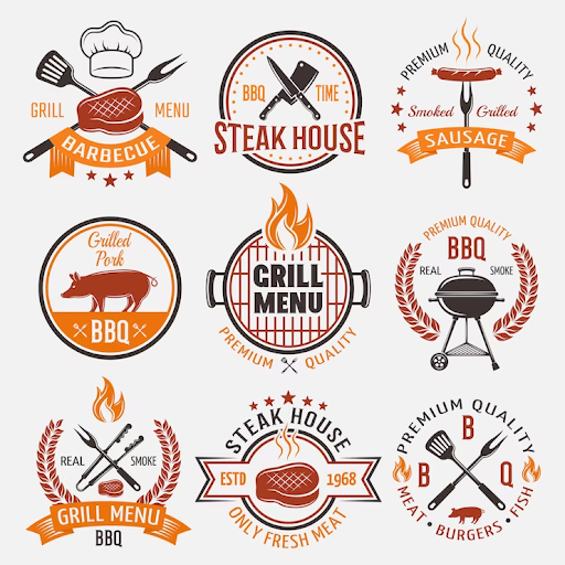
When it comes to successful BBQ logos, there are a few key examples that stand out. Take, for example, the logos of known franchise chains like Famous Dave’s. The Old Carolina Barbecue Company, Jim ‘N’ Nick’s Bar-B-Q, Famous Chaps Pit Beef, and Calhoun’s. All of these companies’ logos have become memorable thanks to the use of the colors red and black. Contrasting elements, and iconic symbols of BBQ meals (i.e.: forks, smoke, and grills).
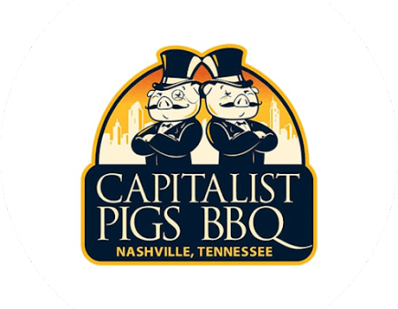
businesses is the Capitalist Pigs logo, a memorable icon created around the unique needs and goals of this business.
Additionally, some logos have added playful and memorable characters like friendly animals and mascots wearing chef hats to become even more memorable.
At The Logo Company, our dedicated team specializes in Food & Drink logo design. Among our most successful logos for BBQ

Finding The Best BBQ Logo Ideas: Work With a BBQ Logo Creation Expert
Ultimately, when it comes to finding the best BBQ logo ideas, working with a BBQ logo creation expert can make all the difference. When working with our team, the expertise and experience in creating logos specifically tailored for BBQ businesses can ensure that your brand is represented accurately and effectively.
So why wait? Get in touch with The Logo Company to start the process of creating a standout BBQ logo. One that will set your business apart from the competition. Get started today!
