
When you go to the movie theater, have you ever stopped and really looked at the movie posters displayed there? You can find posters that are promoting a new upcoming blogbuster, a timeless must-see or a captivating documentary for example.
No matter what, these posters all do one thing well – they use a single picture to show what the movie is all about. You can often determine the genre and key elements of the plot simply by glancing at the poster, which is a testament to their influential power.
Therefore, it can be interesting for your company to look at film posters for inspiration when you are designing or updating your logo. The creativity and passion that goes into creating them can help you work with a designer to come up with a unique and compelling logo. In this blog article we have summarized for you the most important components for an effective movie poster as well as some examples for inspiration.
Components of an Effective Movie Poster
Let’s start by looking at the components of an effective movie poster to understand how they can be connected and beneficial to logo design.
Typography
One of the first things you might notice about a movie poster is the typography. Many posters use unique fonts and lettering that highlight the plots and themes of the films they represent.
One iconic example of compelling movie typography is the lettering used on the posters for the Harry Potter movies:

The logo uses a typography that is exclusively designed for the Harry Potter movies. It incorporates graphic elements that evoke a magical aura and remind us of Harry Potter’s world. Important to mention here is the graphic element which is presumably supposed to be a reminder of the “lightning” scar that appears on the forehead of the book’s hero. Using such unique elements in your typography can make you stand out from others and connect to the plot of the story. As you can see, the lettering echoes the infamous lightning-shaped scar that appears on the hero’s forehead.
Images, Photos, and Icons
Besides the typography, images, photos and icons that are being used in film posters are important to consider. These can assist in conveying the film’s plot and genre. Some posters are busy, but some are deceptively simple. Look at this example for the American comedy-movie Sideways:

This film is about two friends who go on a wine-tasting trip before one of them gets married. Along the way, their lives get off track a bit – they are thrown out of their comfort zone. It’s not unreasonable to say that one of them, at least, is trapped in the bottle, metaphorically speaking. The film poster plays with this metaphor and despite its simplicity it conveys a key message of the film.
Colors and Composition
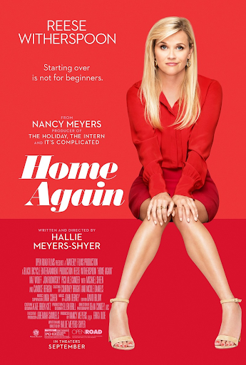
Finally, the third key element of movie posters is are the colors used and the composition of the images themselves. Colors have psychological meaning and impact. For example, red conveys excitement and passion, which makes it a popular choice for romantic comedies, such as the movie poster of Home Again.
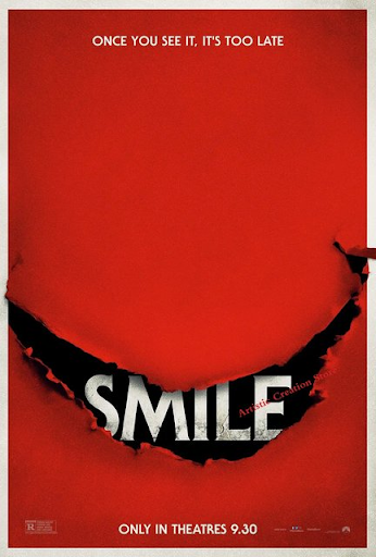
However, it can also be used to represent blood and violence, which is why it makes an appearance on many horror movie posters. The horror movie Smile is similar in appearance to that of Home Again, but aims for a completely different effect.
As we can see from these examples, the same color can have different associations. Therefore, you should think carefully about the choice of color and whether it aligns with the message the movie is trying to convey.
Next to that, the composition of images can offer another way of designing your movie poster. Usually this composition determines where your eye will be drawn first. Some movie posters have several images competing for attention. However, but those that are most effective tend to focus on a simple imagery that captures the viewer’s imagination.
Examples of Effective Movie Posters
Let’s examine five movie posters that have been particularly successful in capturing the essence and plot of their films. This then can provide valuable insights why such designs can be helpful in choosing a suitable logo design for your company.
Jaws
With its ferocious teeth and the unsuspecting swimmer, Jaws and its movie poster have risen to icons not just only within the film industry.

Really, By utilizing graphic imagery, the poster of Steven Spielberg’s famous movie, is successfully capturing the audience’s attention. With the great white shark it is particularly effective, as it taps into a preexisting fear that many people already had prior to the film’s release. Also the blocky red font gives a glimpse of the violence to come. This movie poster therefore is a great example of conveying the emotions that the film intends to evoke. Playing with emotions can also enhance your business logo. Think about what you want to trigger in the viewer and use this as a ground stone for your logo design.
Maleficent
Maleficent was a retelling of the classic story of Sleeping Beauty from the viewpoint of the queen.

This poster uses the iconic silhouette of the villain made famous in Disney’s Sleeping Beauty, but with a twist. Here, Maleficent is more beautiful than scary, and the incorporation of the imagery of Beauty herself into Maleficent’s silhouette implies that there might be more to this story than viewers suspect. To play with this mysterious vibe, can enhance the curiosity of the audience and may cause a greater interest to watch the movie. Curiosity for more should also be the aim with your logo. Try to create a desire for more with your design and arouse interest in your brand, by playing with different shades, tones and shapes.
The Godfather
The Godfather is certainly the most famous mafia movie of all time, and its poster is as iconic as the movie itself:

The poster’s design is kept rather simple, with the image of Marlon Brando taking a backseat to the marionette strings which appear in the lettering of the film title. These strings symbolize the title character’s role as a puppet master – someone who holds the power to manipulate others to achieve his own ends. Despite the simplicity of this movie poster, it conveys the core message. Something to keep in mind, when you are designing the logo for your business. It does not necessarily require a lot of catchy elements, decide for those that represent what you stand for.
Zodiac
Zodiac is a film that traced the efforts of police and reporters to track down and arrest the infamous Zodiac Killer.
This is another very simple poster. It shows the Golden Gate Bridge enveloped in fog. In the film, and in history during the time that the Zodiac Killer was active, the city of San Francisco was certainly enveloped in a metaphorical fog. The plain font adds to the poster’s appeal by leaving the main stage to the in fog covered bridge. By incorporating crosshairs in place of the letter “O” in the word “Zodiac,” the movie signifies that its focus is less on the killer’s identity and more on the intense pursuit to capture him. Such hidden elements can lead to conclusions about the plot of the film.
Consequently, the fascination with a logo can be maintained using these hints, which may not be apparent at first glance. Keep this basic idea in mind for the design of your logo. This allows you to stand out from the competition and remain exciting for your target audience.
Empire of the Sun
Finally, the film Empire of the Sun told the story of a young English boy who was taken captive and put into a Japanese prison camp.

The poster shows a red sun, which echoes Japan’s flag. The image of a plane going down combined with that of a boy on the ground leaping up represents the friendship that develops between the boy and a captured sailor. The barbed wire at the edge of the poster gives a hint of the prison camp setting, but the focus is on the boy.
This logo plays again with the ambiguity of symbolism. Always keep in mind for your business to check the symbols and icons you are incorporating. Not that these lead to different interpretations in different cultural contexts. This is particularly important if you aim to serve an international market with your market.
How to Gain Inspiration from Film Posters for Your Logo
Let’s explore how you can draw inspiration for your logo from movie posters, based on what we have already discussed.
There are three basic takeaways here:
1. Conveying Complex Ideas with Simple Images
One thing that you may notice that all of these posters have in common is their relative simplicity. None are particularly busy. Even though it has most elements, the Maleficent poster is still simple and comprehensible.
The key thing to remember is that audiences – whether we are talking about your target audience or a movie audience – are looking for a fascinating design. They understand stories and imagery far more than they think they do, and you don’t need to spell everything out for them. The Sideways poster is a good example. The fact that the men are trapped in the bottle tells audiences quite a bit about the movie without actually giving away the plot.
They might or might not know that wine bottles are stored on their sides, but they don’t need to know that to appreciate the poster. When it comes to creating your logo, sometimes the most effective designs are those that use widely-known symbols in a unique and clever way. By doing this, you can tap into the power of recognition that these symbols already hold in the minds of your audience. People will then be able to connect their association towards certain symbols to your brand. Therefore, you should conduct a thorough research about the images and icons you are planning on incorporating before actually designing your logo.
2. Minimalism
The next thing you can learn from movie posters is the impact of minimalism. A very simple logo can convey a great deal.
The next thing you can learn from movie posters is the impact of minimalism. A very simple logo can convey a great message. Some of the most famous logos in the world, such as the McDonald’s Golden Arches or the Nike Swoosh, are incredibly simple. Any child could draw them – and yet everybody recognizes them instantly.
You might have many ideas that you want to convey with your logo, but you should pick the most important one and work with that. What image or icon will get your point across at a glance? Whatever it is, that is the element you should use in your logo.
3. Layering
The final takeaway here is that the use of layering can help you get the point of your logo across effectively. The Maleficent poster does this by giving us a glimpse of Beauty in the middle of Maleficent’s silhouette. Many logos use one image inside another to communicate with the company’s target audience. Can you combine two images into one or incorporate an icon into your typography? Anything you can do to add meaning to your logo without complicating it is a good thing. Some companies layer their logos by using more than one kind of typography in it. When your company is offering several products or services, you can convey those visually by selecting lettering in your logo that represents each one.
Conclusion
Movie posters are full of creativity, color, and inspiration. You don’t have to copy them to allow them to help you conceptualize a new logo for your company branding strategy. Just keep in mind that less is more, and remember, above all, that your audience is smart. If you do that, the rest will follow. Did you now get inspired to design your business logo by these movie posters? We at The Logo Company are happy to accompany you along the way to the creation of your logo!