Color Science And Gradients In Logos
Let’s talk a bit more about color science. First of all, the use of color when designing a logo is much more complex than simply choosing, “my favorite color”. Color science, and more importantly, color combinations, can impact a logo design in ways that are not necessarily technical. Emotional responses to certain colors, for example, may range between love and rage (red). Warm and cold (blue), etc., depending on the context. Yet colors are very much based on scientific research. Certain colors can actually make people feel hungry.
As an example, a company that is in an environmentally friendly business may naturally see green as a color to use, and at first glance, that does make sense. But what if their business includes endeavors that are both land and sea based? Now blue becomes a viable color choice, and additionally, the color spectrum between the two. Which brings us to gradients.

Here is one of our logo designs with a smooth gradient from light green to blue.
What is a color gradient fill?
A gradient, also known as a fountain fill, is basically a gradual change between two colors that creates a light to dark effect, the intensity of which depends on the base colors. The most easy example would be black to white. Black is 100%, and white is 0%, so we potentially have 100 ‘steps’ between the two. Seems easy enough, right? Not so fast.
Gradients In Logos Is Crucial
There are a wide array of methods used for reproducing artwork. The type of media the graphic is being applied to, the size, screen print versus newsprint versus digital media… all must be considered. It looks good on a business card, but will it work on a billboard? Will it work in the column format of a standard newspaper and still fit comfortably on a TV screen?
And equally important, the gradient that looks so good on the computer screen– how well will it reproduce when it’s printed?
Color Science And Banding
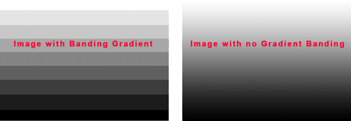
When it comes to any kind of traditional printing, 0 to 100% is at best a relative term. Realistically speaking, there are actually only 20 steps between 0 and 100. That is a color gradutaion in increments of 5%, and that’s some seriously specialized printing. More often than not, when a gradient is enlarged, banding inevitably will occur. Conversely, when reduced, the gradient will often become washed out or muddy.

Banding can be intentionally incorporated into a design, but usually, it will be in a way where SOLID colors are used in the evolution. Red block, orange block, gold block, for example; or a maximum of ten steps of 10% each, where the defintion of each step is in fact part of the design. The Pantone Color Matching System is the standard in color definition for print media, so each of the ten steps actually corresponds to a numbered Pantone color, making each step a stand alone color that can be reproduced consistently.
The problem with banding, and gradient fills in general is, they are very difficult to reproduce in certain formats. When improperly applied, gradients can end up detracting from an otherwise attractive logo design.
The complexities involved in the use of color and shading like even colors like silver or gold, is just one example of why it’s critical to contract a professional design team to create a unique and recognizable identity for your business that also meets the widest variety of production standards.
More Color Science, How to Make Sure Your Colors and Gradients Look Good
A professional graphic designer is the key to taking all these factors into consideration and making them work harmoniously when designing a logo. Not necessarily selecting base colors, (after all, the client has a vision that must always be factored in) but incorporating them effectively into a design that will serve in any format required, while still honoring the vision of the client and successfully representing their brand identity.
And that’s what we do.
