In the world of logo design, styles come and go, but some trends manage to overstand time, leaving an indelible mark on pop culture. One such iconic style are pin up logos, which draw inspiration from vintage pin up art. Evoking a sense of nostalgia and glamor, pin up logos have found their way into various industries. Captivating audiences with their charm and empowering messages. In this blog post we will explore how the pin up logos have evolved and what elements are typically contained in such designs.

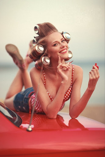
Photo by ArtHouse Studio
The evolvement of the 50s pin up girl logo
To understand pin up logos, we must first delve into the roots of pin up art. Originating in the late 19th century, pin up art gained popularity during the early 20th century. Reaching its peak during the 1940s and 1950s. These artworks featured glamorous and often flirtatious depictions of women, presented in a playful and seductive manner. The iconic illustrations adorned several postcards or calendars for example. (Source: Pin Up Art
However, critics have argued that the historical context of pin up art can carry objectifying and sexist connotations. Therefore, modern interpretations of pin up logos have transformed this art form into a symbol of empowerment and body positivity. Today’s pin up logos celebrate the strength and confidence of women. Breaking free from stereotypes and embracing diversity. They convey messages of self-assurance and encourage embracing one’s unique beauty. Resonating with a more inclusive audience.
Nowadays, companies in various sectors take this symbolism to promote their business and convey their brand personality. For example, tattoo and body art studios adopt such pin up logos to complement their edgy and artistic atmosphere. But also in the entertainment or music industry these logo designs can be found, especially for those with a vintage or rockabilly style.
Design a pin up girl logo
Designing a pin up logo requires a seamless blend of various elements. At its core, the pin up logo celebrates the beauty and allure of the female form. Embracing confidence and empowerment. Central to any pin up logo is the portrayal of a curvaceous and confident woman. The exaggerated curves accentuate the feminine form, depict the celebration of beauty that transcends time. Also the pin up girls’ hairstyle and makeup are a big deal! Think about cascading curls, flawless victory rolls, and those classic makeup styles. Also the clothes can convey the retro look with high-waisted swimsuits, struts in playful polka dot dresses, and pencil skirts like a true fashion icon. Every little detail matters in making the logo look just right and telling its own unique story.
Be bold: Colors for your design
Picking the right colors for your pin up logo is another essential part in the designing process. Think bold and choose vibrant hues that scream vivacity and seize the spotlight. Obviously, red is the fiery heart of the pin up world and therefore often used in pin up girl logo design. Just like the classic red lipstick that became an iconic symbol of femininity, the color red in this context is an emblem of empowerment, symbolizing a celebration of femininity in all its forms.

But also other colors such as blue with its charming vibe or yellow that transfer warmth and optimism can be an excellent choice for your vintage pin up logos. When these colors dance together, they create a visually striking image that captures attention and lingers in memory. The rich and saturated tones pay homage to the pin up era’s vibrant spirit. But keep in mind with all boldness, the colors should still match to avoid an overload of impressions for the viewer.
Lettering and typography
Typography plays another crucial role that adds depth and character to your pin up logo. Whether through elegant script fonts or bold display typefaces, the typography must complement the overall vintage vibe, echoing the classic styles of the era. Serif fonts with distinct characteristics, like slab serifs or art deco-inspired letterforms, can add an authentic touch to the logo, reminiscent of vintage advertisements and magazine covers. While script and display fonts often take center stage, it’s crucial to also maintain readability. Clear legibility ensures that the logo’s message is easily conveyed to the audience, creating a lasting impact. As you can see, the lettering becomes a part of the story, weaving together the narrative of a time gone by.
Example of a pin up logo
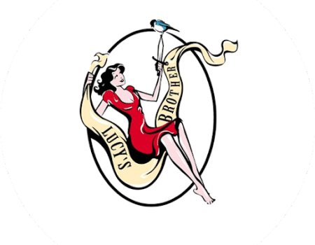
The music publishing company “Lucy’s Brother” decided to go with a pin up logo and to benefit from this design to convey a creative and modern message. For this they chose a pin up girl sitting on a kind of swing with the logo printed on it. Here they also worked with the classic color for pin up girl logos. Namely red for the dress. This logo is like a small world filled with art and meaning. It shines with a mix of feelings, and it’s on track to become a memorable symbol in the music publishing world.

Conclusion: What to keep in mind when designing your pin up logo
When designing your pin up logo, there are some key elements to consider. Be aware of your target audience and the industry you are operating in. After all, this kind of design is not for everyone. Take also into account which colors, typography and symbols can assist you in your design. However, if you are still unsure whether such a logo is right for yourbusiness, we at The Logo Company are here to help! We can help you design a professional pin up logo!
