It is June, and as many of you know that means Pride Month! It is celebrated to honor the 1969 Stonewall Uprising in Manhattan. This was a series of spontaneous demonstrations by members of the LGBTQ+ community. Actually, in response to a police raid on the Stonewall Inn, a popular gathering place for queer people at the time (Source: )In the meantime, the movement has spread across the globe. Companies have also started to incorporate Pride Month into their communication, marketing and logo design. But what exactly is pride logo design and what are the possible pitfalls your business might face? This we will answer in the following blog post – so let’s get started!
What is a pride logo?
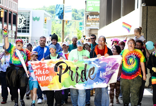
First of all, we need to clarify what is meant with the term pride logo. It refers to companies that may modify their existing logos by adding rainbow colors or incorporating LGBTQ+ symbols into their design. With this, brands want to visually demonstrate their solidarity with the LGBTQ+ community, promote inclusivity, and show support for equal rights. Next to that it also assists in raising awareness of Pride Month. And the ongoing challenges faced by the LGBTQ+ community.
Symbols for your pride logo design
One of the most known symbols in pride logo design is the pride flag, also known as the rainbow flag. It consists of a vibrant spectrum of colors, representing the diverse identities within the community. But there are other pride flags representing the various identities in the LGBTQ+ community. For example the transgender pride flag, bisexual pride flag, and lesbian pride flag, among others. These flags often have their own distinct colors and designs, reflecting the unique experiences and visibility of different LGBTQ+ groups.
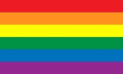
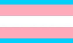
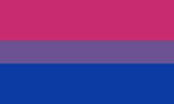

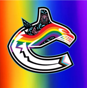
For example, the ice hockey team Vancouver Canucks incorporated a combination of different pride flags in their pride logo this year. However, the rainbow flag is still among the most commonly used pride symbols.
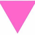
Pride logos can also incorporate other symbols, such as the pink triangle, a worldwide symbol of gay power and pride nowadays. But this has not always been the case since it was born from a dark period in LGBTQ history and world history. Nazis forced people they labeled as gay to wear inverted pink triangles. However, in the meantime the pink triangle has been reclaimed as an empowering symbol. It ultimately demonstrates a reminder to never forget the past—and to recognize the persecution LGBTQ people still face everyday. Check out this article to find out more about the evolution of the pink triangle.
What to consider when designing your pride logo
Now that we looked at what pride logo design is, we will take a look at how companies are incorporating Pride Month in their logo design:
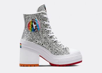
Converse for example once again decided to include an entire Pride Collection in their product offering this year. They didn’t just limit themselves to one pride logo on the occasion of Pride Month, they even chose different designs on their shoes. They all have something in common – the rainbow, sometimes only visible in the star, sometimes beyond the edge of the logo. With this variety, there is something for everyone and the shoes score with their extraordinary pride logo designs. With that Converse demonstrates their support and commitment and position itself as an inclusive brand. This can also be worth considering for your business, to create different logo designs depending on the interests of your target group and your product offer.
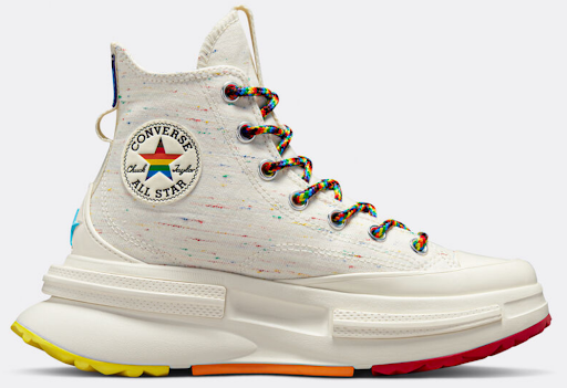
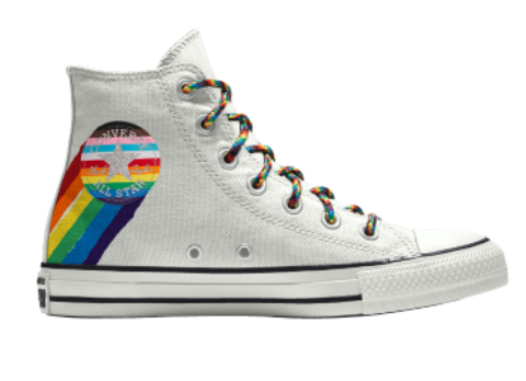
Source Converse Pride
Pink washing
When talking about Pride Month, one also comes across the term Pinkwashing. This means that a company puts a rainbow flag or LGBTQ+ symbols on their logo or products. However without actually doing anything meaningful to support the community. Basically, they are using the rainbow as a marketing tactic to appear inclusive and supportive during June. However, behind the scenes, they may not have LGBTQ+-friendly policies or may even engage in practices that harm the people. In order to avoid that for your company, you should make a genuine commitment to diversity and inclusion throughout the year. Certainly, not just during Pride Month. Educate yourself about the specific needs and challenges faced by the LGBTQ+ community and instead of merely using symbols or gestures. Take real action to support and anchor this in your brand identity.
Do’s and Don’ts for your pride logo
Now that we looked at what pride logo design is, we will take a look at how companies are incorporating Pride Month in their logo design:
Converse for example once again decided to include an entire Pride Collection in their product offering this year. They didn’t just limit themselves to one pride logo on the occasion of Pride Month, they even chose different designs on their shoes. They all have something in common – the rainbow, sometimes only visible in the star, sometimes beyond the edge of the logo. With this variety, there is something for everyone and the shoes score with their extraordinary pride logo designs. With that Converse demonstrates their support and commitment and position itself as an inclusive brand. This can also be worth considering for your business, to create different logo designs depending on the interests of your target group and your product offer.
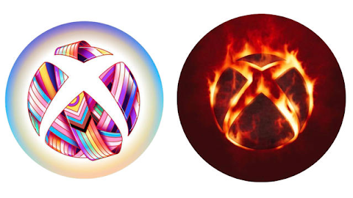
This year Xbox decided to incorporate almost all different kinds of rainbow flags in their pride logo. At first glance a very successful logo design, which also represents the diversity of the community by incorporating multiple pride flags. However, three days later, on the occasion of the release of Blizzard Entertainment’s Diablo IV, the company changed their logo engulfed in fire. While it can be assumed that it was not Xbox’s intention to make it look like the pride logo would burst into flames, the reaction on social media followed immediately and accusations of pinkwashing became louder. As you can see, just a well-designed pride logo isn’t enough. On the contrary, your logo design strategy during Pride Month is multi-layered and you need to consciously align your other branding and marketing activities to avoid such misconceptions.
Conclusion: What to bear in mind when designing your pride logo
As we could see with every pride logo design come opportunities and pitfalls. Before you decide to just go ahead and lay the rainbow over your logo, you should consider your motivations carefully. Once you have settled for a well thought through strategy that also extends beyond June you can get started. You can incorporate different symbols into your pride logo, there are no limits to your creativity. The support of a professional logo designer can also be beneficial here. But remember, Pride Month is an important event for the LGBTG+ community and shouldn’t be used solely to market your products or services. This is how you stay true to your brand as well as your community and avoid pink washing.
