Every day, new programmatic ad platform logos are created, and they should be unique, bright, and recognizable, like people’s faces. In old westerns, cowboys used branding to mark the ownership of their cattle. The purpose of a logo is the same: having it on your website and other digital products indicates ownership and tells potential customers what type of service you offer.

A programmatic ad platform logo reveals character and reflects personality. Some companies want to emphasize reliability, stability, and status, so they choose simple, and sometimes even strict, logos in the minimalist style. Others prefer attracting attention with bright colors and unexpected images, emphasizing creativity and positivity. So, let’s discuss how to create a programmatic ad platform logo.
Creating a logo for a programmatic ad platform
Creating a unique logo for a programmatic advertising platform starts with a great idea. Every day, it will explain to a potential client why it is worth cooperating with you. Before you start creating it, find the answers to the questions:
- What beliefs and values does your programmatic ad platform have?
- What should the logo tell potential clients?
- What makes you special?
- What do you do better than the competition?
A programmatic ad platform logo must show who you are and what you do. Colors, logo shapes, typography, and other design elements directly impact your audience’s perception of your brand. If you do everything right — the loyalty of a potential client is guaranteed. There are 5 characteristics of an ideal programmatic ad platform logo:
- Right shape
- Ideal business lines
- Unique combination of colors
- Reasonable conformity to trends
- Right size
What images, colors, and fonts do advertising companies choose?
A successful programmatic ad platform logo will be well remembered, evoke emotions, and increase the trust and loyalty of the audience. Therefore, its development requires a good idea and properly selected design elements (color scheme, font, shape and symbol).
In the advertising industry, the most common logos are text and combined logos, which combine a symbol and text.
When creating logos for programmatic advertising, abstract elements, geometric shapes, lines, and stylized images of animals are most often used. For text design, simple sans serif fonts and handwritten font styles are chosen.
As for the color scheme, the most common are one- and two-color logos using blue, gray, red, black, and orange shades.
Programmatic ad platform logos: color scheme
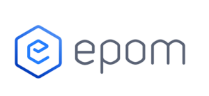
Ad companies worldwide choose predominantly two-color logos, but signs painted in a single color are also common. The logo for Epom AdTech solutions is a prime example. Combinations of black with other bright shades, as well as gray-blue and gray-orange color schemes, are popular.
Combinations of three or more colors are less common. Features of color use in programmatic advertising logos:
- USA. Monochromatic advertising logos are the most common here. Black comes first, followed by orange and blue. If two colors are used, combinations of gray with red and black with different bright shades (blue, purple, orange, etc.) prevail.
- Europe. European countries are also more characterized by monochromatic logos. Advertising agencies’ favorite shades are black, red, and blue. If they choose a two-color sign, black-blue and red-white combinations prevail.
- Asia. Unlike Europe and the United States, Asian companies more often use two colors (blue with orange, red with yellow, gray with black, and black with bright hues) when creating logos.
The global advertising market is very fond of black, blue, and orange/yellow shades. These colors are often used both as the main tone and as accents.
Images and symbols in programmatic ad platform logos
According to statistics, most advertising logos, regardless of continent, country, or region, are typographic. Companies prefer simple logos because they are well-perceived by the audience and easy to remember.
In second place in popularity are combined logos that combine text and symbols. They attract attention to the company and emphasize its individuality.
Geometric shapes, different lines, and abstract elements are most often used in such logos. If companies want to stand out among competitors and intrigue consumers, they choose stylized images of animals and birds.
European businesses prefer geometry and animals, American businesses use mainly geometric shapes (circle, square, triangle), and Asian businesses like font logos without any symbols. However, if a picture is present, it will all be the same geometry and lines.
The scientific basis of graphic design: each shape has its visual associations, so you need to harmonize the shapes of the logo with the brand’s message to its target audience:
- Circle or oval — inviting and friendly.
- Volumetric lines — relaxing, intriguing, and playful.
- Geometric shapes — dominance, leadership, authoritarian, efficient, safe and secure.
- Spikes and sharp angles — aggressive, edgy, and unusual.
- Horizontal lines — reliability and stability.
- Vertical lines — success and prosperity.
Brainstorming can help you find an ingenious solution. In the process of creating a programmatic ad platform logo, it is worth trying to think like your potential audience. Create a list of associative words that describe the programmatic ad platform. Once there is a clear idea of your brand, it’s time to start translating ideas into a design.
Font as a way to create a unique programmatic ad platform logo
The most popular are simple sans-serif fonts and font styles with soft lines. Handwritten fonts are also often used to emphasize creativity and lightness. The specifics of using fonts in ad logos:
- By writing — Latin fonts prevail over Cyrillic fonts.
- By type — sans serif fonts and handwritten font styles are most often used.
- Case — uppercase fonts are used in 50% of advertising logos, followed by lowercase and mixed fonts.
- Lettering — straight text is predominant, but slanted and italic is also common.
- By the thickness of the line — most logos have medium-thick letters, and bold lines occupy the second place.
If we compare the peculiarities of using fonts when creating logos in different countries, we will see that sans serif and uppercase fonts are the most popular. The emotional tone of font solutions in a logo:
Serif fonts are associated with tradition, reliability, respectability, and comfort.
Sans serifs are clean, unbiased, and modern.
Handwritten fonts are associated with creativity, elegance, and grace.
As you have noticed, each font conveys its mood and personality to the brand: seriousness and sophistication or playfulness and carelessness. When choosing a font, it is worth considering not personal preferences but the peculiarities of your programmatic ad platform.
Many programmatic ad platforms in the USA, Europe, and Asia choose simple and soft fonts. To attract attention, build up from competitors, and create an unusual accent, they like to experiment with the lettering, for example, tearing letters or creating blurred edges.
To create unique logos, choose simple fonts and add interesting techniques. Handwritten fonts emphasize creativity and positivity.
Tips for programmatic ad platforms on logo design
When creating a logo for a programmatic advertising platform, the first thing a designer thinks about is choosing the right aesthetic design for a brand that will be timeless. Yes, a trendy logo may attract attention for a while, but with the advent of new trends, there is a risk of owning an outdated logo. The classic aesthetic does not allow for crazy color palettes. Using a classic style lets potential clients know that your programmatic ad platform is reliable and practical.
When creating a logo, consider all the different associations that might come to mind when looking at it. Will the potential audience understand the brand message?
To create a logo that will clearly communicate the brand’s message to the target audience, you need to analyze the logos of your successful competitors. There are two strategies: mimic by adjusting to your competitors’ colors and style or contrast. You should not use too many fonts and colors. The “cleaner”, more readable, and simpler your logo is, the faster it will become recognizable and memorable among the potential audience.
Conclusion
A non-standard approach is important when creating a logo for programmatic ad platforms. This will not only help demonstrate the platform’s capabilities but also allow it to stand out in the market and arouse interest among consumers.
By integrating thoughtful design principles with strategic marketing insights, brands can create logos that resonate across diverse digital programmatic advertising platforms, enhancing recognition and fostering trust among consumers. Ultimately, the blueprint for successful branding in programmatic advertising lies in balancing creativity with analytics, ensuring that every visual element works harmoniously to drive engagement and loyalty.